Web design’s influence on sales, branding and the composite success of your product seems to be obvious, but some business owners still struggle to see the connection and underestimate the value of aesthetical representation.
We consume tons of visual information each and every day, and that’s the main reason why good web design is a must. Otherwise, high bounce rates will become your permanent companion.
What’s the bounce rate for websites?
Let’s suppose you have an offline store, and you have lots of visitors per day, but most of them simply come and go, without taking any further actions or purchasing any products. That’s a pure representation of a bounce rate. In plain language, bounce rate is when a user leaves your web page as soon as he/she enters the page, without taking any further actions. Site bounce rate may be one of the most significant metrics when it comes to online marketing because it shows the total efficiency of your brand. The bounce rate represents the quality and relevance of your webpage.
Tools for checking site bounce rate
So, where can you review your web page bounce rate?
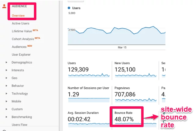
If you own a website or a product, Google Analytics is an irreplaceable tool for a common marketing review of your website and a reliable source for analytics. If you want to see your bounce rate, open up Google Analytics, go to Behavior → Site Content → Landing Pages, and then choose Bounce Rate.
Reasons for high bounce rate
Partly, bounce rate can be described as a psychological factor, but there are things that can be reviewed to enhance your website.
Here are some of the main reasons for high bounce rates on your website.
Poor web design. If your site looks like it hasn’t been updated for decades, users probably will choose your competitor with a more attractive website appearance. Inconvenient navigation a.k.a. terrible UX. Users value their time, and if your website isn’t structured in a plain way they may simply flip out and choose not to deal with you. Cluttered with ads. Websites full of visual debris usually distract users from the main theme. Website errors. If your website has issues with the correct work in different browsers or devices, either technical problems or errors, people are more likely to bounce off either technical problems or errors. Slow-to-Load Page. Google’s ranking system considers site speed as a vitally important ranking factor. Deceptive title or meta description. You probably thought that it’s not really relevant, but it is. Meta descriptions are a snippet of your webpage, by which users decide whenever they should visit your site or not. Sophisticated registration form. You haven’t built entrusted relationships with your user yet, but you’re already requesting way too much data from them. Banners, polls, and pop-ups. Don’t scare off your new visitors with lots of irrelevant content.
What’s the average bounce rate?
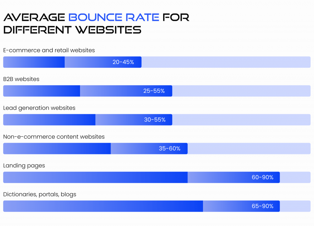
So, you’ve checked your bounce rate and got frustrated with numbers. As a broad rule of thumb, the medium bounce rate for your website is approximately 40-55%. You’re doing a great job if your bounce rate is lower than 40%, and if the numbers are above 60%, you’ve got work to be done! If your bounce rate is over 90% or below 20%, that may indicate a tracking or code installation error.
25% or lower: something may work incorrectly 36-40%: excellent 41-55%: the golden mean 56-70%: higher than usual but might be meaningful for your website 70% or higher: terrific! or something works incorrectly
Is a high bounce rate always bad?
Once again, you’ve checked your webpage bounce rate, compared the numbers to statistics and now you’re terrified? Take it easy! Bounce rate usually becomes a so-called vanity metric, but there are also cases when your site is performing properly and a high bounce rate is not the verdict.
First of all, you should take into account that every industry bounce rate is completely different. Let’s assume your bounce rate varies from 70% and higher, but your product is an online dictionary, that’s just fine! When a user searches specifically for one answer and instantly finds it, that’s an excellent user-oriented page. If you’re creating a wholesome and self-sufficient type of content, you’ve got nothing to worry about. To ensure, you can check Average Session Duration or the Time Spent on Page metrics in Google Analytics.
Does bad web design affect bounce rate?
Probably everyone has heard the “Don’t judge the book by its cover” quote. Well, it may be implemented in other spheres, but certainly not in your site design. The main reason for the increasing web bounce rate is the lack of highly engaging content, which is commonly a consequence of poor web design. According to Stanford research, most users evaluate a site’s credibility based on its design first, and content afterward. Moreover, forming an opinion takes only half a second!
Another vitally important thing you should keep an eye on the web design correspondence with the theme of your page. For example, if you run a law firm and your website has GIFs with glittering violets and kittens, this will surely be misleading for visitors and form a superficial reputation of your business.
Top 7 tips and tricks to decrease bounce rate on pages
1. Design and visibility
Of course, web design is your calling card. As was already mentioned, a user needs less than a second to judge your business, and the first impression is fundamental. So, if your page looks outdated and chaotically designed, and its visibility reminds you of the prehistoric period, well, you’ve got lots of work to do.
You should ask yourself a question: how does your business stand out? Highlight your main benefits, analyze your competitors’ sites and choose the branding strategy that will make your business memorable.
Did you know that your website appearance also affects the success of your SEO campaign? Your page’s web design explicitly affects how search engines crawl and index your site. Beautifully web-designed pages are more likely to be successful in building trustworthy relationships with their users. On the other hand, unattractive and outdated websites almost never get lucky enough to catch user’s attention.
Moreover, your competitors have already done that! If you want to live up to the date, don’t hesitate to submit your website weaknesses and be ready to invest in converting them into your strongest benefits.
2. Navigation
The user can be imaged as a moody child: he/she wants what he/she wants right here and right now! And if you can’t give that, you’ll simply lose the lead. Proper website navigation is one of the most significant aspects of decreasing bounce rates. Judge for yourself, when you search for the exact apple pie recipe, you’re definitely not interested in reading an article about the top 10 tips for choosing ripe avocado. If you wanna keep users on your page, you must help them to access the information easily and implement navigation that fits with intuition.
3. Page load speed
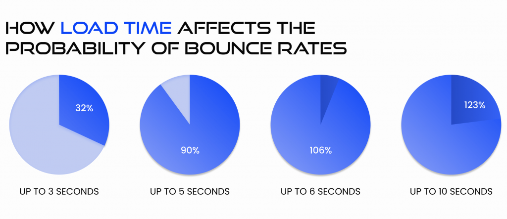
In fact, 53% of users leave pages that load longer than 3 seconds. Furthermore, load time is one of the most important ranking factors, based on which Google rates your website.
4. Review your content
Content is the king. We live in a constantly changing, hustle-bustle world. Can you safely say your last year’s article still remains relevant? Content should always live up to the hype!
5. Readability
Make sure your content is readable and easy to perceive. Use short and meaningful sentences, differentiate text with paragraphs and headings. Spell-checking your text is a must!
6. Use visual content to engage your users
Human beings are visual creatures. Over 90% of the total information transmitted to your brain is visual. We retain information better from pictures, and that’s why you should use eye-catching images to depict your content’s essence. But what’s the highest-ranking method to engage your audience? Videos capture attention, drive more traffic to your website and improve brand recall. Let’s see some statistics:
- Four times as many customers would rather watch a video about a product than read about it
- Social video generates 1,200% more shares than text and images combined
- Incorporating video into a company’s landing page can increase conversions by 80% or more
- 1 in 4 consumers actually lose interest in a company if it doesn’t have video
- Companies using video see 41% more web traffic from search than non-users
7. Rework your targeting
Pay special attention to creating meaningful meta descriptions for your site. This way, users will get more understanding about the content of your webpage and the bounce rate will decrease due to filtering the irrelevant visitors even before they enter the page. Furthermore, you should consider including your keywords in the meta description.
Responsive web design bounce rate
Nowadays, the majority of websites are being browsed through mobile devices. In 2017 Google started inputting mobile-first indexing for all websites and Googlebot mobile became the main crawler. That means that the mobile version of the website has now become the main one, and the desktop version counts as an additional.
What is responsive web design?
Responsive design is an approach that adapts your website to display smoothly on any possible device. Designers create all webpage elements with a flexible grid-based layout which automatically adapts to the visitor’s screen and shows all content in a balanced and consequent outlook. If you have a large percentage of bounce rates on your website, you should test your website compliance with responsive web design. Your pages should respond to the user’s behavior and environment based on screen size, platform, and orientation. To sum up, the key criteria for decreasing bounce rates are ease of use, plain navigation, and appearance. We cannot deny the web design’s influence on bounce rates in the era of continuous content generation. Well-designed websites with highly engaging content find their audience and turn them into fans who keep coming back for more. Responsive design keeps users engaged on your page longer, and if you are eager to succeed, you must keep it neat!


