
Are you tired of seeing the same template site designs that don’t inspire, inform or work for your business? It’s okay, it happens sometimes. If earlier we wouldn’t pay too much attention to the concept, idea, and even fonts of content on the site, today we face the fact that the requirements for the site have become tougher and more serious. However, the useless website that looks fine, but slowly downloads pages.
Undeniable classics or bold solutions in web design?
Of course, in the first part of the article, we talked about common styles in web design. We talked about the concepts that range from the most primitive to the most common and that still operate today. And to learn more about history, you can read here.
And now it’s a moment to have the time of your life
After all, we will talk about creativity and a new vision in the world of web design. Form, abstraction, bold decisions, and a note of calligraphy. Designers and developers have learned to surprise audiences, even though they are spoiled.
Right. What is the main importance of web design?
For some reason, not all site owners understand that visual design and marketing of the site are connected. So without the correct layout, the website will not bring you profit, and creating a pleasant image of the company can be forgotten. It is a tool that directly affects website performance and market position. Learn more about the importance of a good website for business and why web design is crucial. Now is the time to explore the aesthetics of web design.
BEAUTIFUL TYPOGRAPHY: THE STYLE IMPLIES THE MASTERPIECE OF TEXTING
Beautiful Typography in web design is a style of authentic art that helps the text to find meaning, it is also about the hard work of “typographers”, and graphic designers on web pages. So that letters, numbers, and symbols create a holistic picture and do not cause misunderstandings among the user. It is easy to understand from the Cambridge Dictionary’s meaning because the word root consists of a typo- (like a small mistake in the print material) and a graph- (to create a graph to show how different pieces of information are related). What’s wrong with that style?
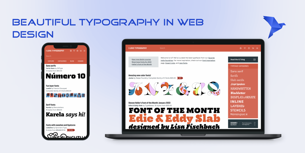
Have you ever seen an example of such a site? I’ll show you now. How superb that his domain name is literally made up of the words “I Love Typography” and specializes mainly in the sale of fonts. If you pay attention, even pictures are composed of text. But, at the same time, the ordinary user understands the meaning of this site from the main page. Although there is nothing unique and unusual: restrained colors, white background, and black fonts.
Typography is the craft of endowing human language with a durable visual form
― Robert Bringhurst
History moment
A fun fact is that the history of the printing house dates back not even to our era. However, these were only the prototypes of the typography: rock inscriptions or scrolls with symbols. Antique Chinese handicrafts are immersed in history. And during the Song dynasty, the Chinese inventor Bi Sheng (972-1051) was the first in the world to apply the mastery of hand printing with a movable font. The rapidly changing use of fonts in the daily lives of Europeans is becoming possible. Johann Gutenberg’s mastery of jewelry in the mid-15th century gave Europe a new era of typography with machine tools. This gave rise to the emergence of the printing revolution in England, France, Italy, and other hard-core continents in the race for technology.
How the first book influenced web design?
The first book which was printed by a jeweler in a movable script based on lead was the book of a collection of religious texts — The Bible. This and subsequent thrust gave rise to the mid-1980s invention of personal computers such as Macintosh. This gives designers a “punch” in the commercial use of digital fonts to frame their early websites. Digital technologies have even made it possible not only to create different fonts, headsets and but to introduce experimental fonts and specialize in their sales. If then they were a limited number, and the cost and time of production are expensive, today we have thousands of free fonts in use. And it’s very good for the web designer now.
Concept. Readable text, stylish design, and holistic picture
Beautiful typography at the core of site creation is an essential component for an ideal user interface. But why? Because it creates a well-structured visual hierarchy and balance of graphically displayed letters. Popular freelancers in beautiful typography design are Micah Bowers, Belinda De Bruyn, and Gonzalo Rodriguez.
The main pros of this style are:
- It’s original and quite unique
- The text most easily reveals the idea of the site
- With the help of ordinary letters, you can even create pictures
The main cons of this style are:
- The abundant use of fonts disrupts the reading of the text and looks dirty
- The font style you have chosen may not be suitable for the site idea. Even selecting the smoothness of the lines can affect the quality
- The font size for headers, profile caps, and content can play a dirty trick: the main highlight focus on aspects that should have been less important to the user
VINTAGE / RETRO STYLE: GIVE ME BACK MY 2007
Vintage style in web design tastes like the smell of the past. Nonetheless, how many years must go by for a thing, an epoch or a design to be considered obsolete we don’t know even today. Moreover, why is everything old so valuable that it’s auctioned off for a fortune? Collectors explain this by the fact that the taste of things that are no longer relevant can reveal a person’s sense of personal uniqueness and preferences. The terms “vintage” and “retro” are often used as synonyms, but they have their differences. The word vintage of Latin origin mainly refers to a subject from or mastery typical of a particular period or work of the artist, aged from 40 to 100 years. Retro refers to the style, or cult for any earlier epoch, written by the other half XIX half of the XX.
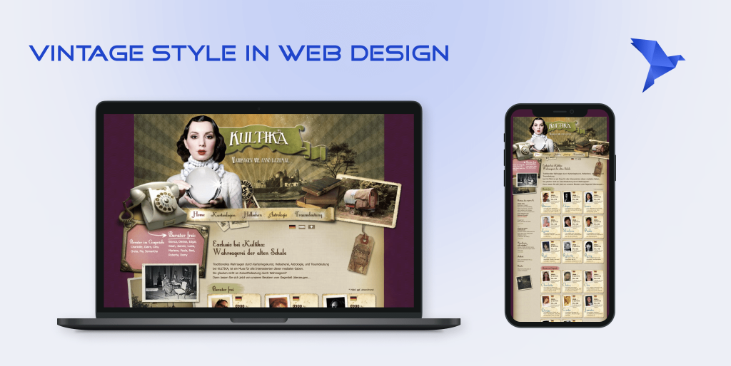
An astonishing example of vintage style is the German site “KULTIKA” about divination using maps, clairvoyance, astrology, and interpretation of dreams. The fortuneteller like a typical witch from 18th century Germany, handwritten font, the old paper background of the main page, and much more, which gives us to plunge not only into the epoch but also into the magical orientation of the site.
History moment
The beginning of the XX Century was used throughout the whole motifs of Gothic, Baroque, and Rococo. To give technical privileges to typographers, a photographic composition was included in the 1960s. For example, the development of grotesque fonts drew inspiration from modern, vintage, and retro styles. Nothing is more attractive than what has long been overlooked.
The “nostalgia spirit” fell into the 21st century
The continuation of the “nostalgia spirit” fell into the 21st century. Social media, media, fashion magazines, and cinema have started to become part of the PR campaign of this style. Then why should web design miss this possibility? Designers use practices that can take you to the dinosaur era, with the help of creative types of font, placement of content, and deformed objects under the old forms.
Concept. Stylish, old-fashioned, and elegant
The real taste of the “outdated” era. If you’d like us to remember you with ancient fonts, and signboards, with elements of the old radio and TV, then look at it.
The main pros of this style are:
- The atmosphere and the user’s sense of self in it
- Thematic. From the Western to the Magnificent century
- Unique patterns that can imitate old letters or posters etc
The main cons of this style are:
- The narrow focus on customer products
- May look boring or irrelevant to some users
- Limitations in GIF components, content animation, and other interactivity
GEOMETRIC: I’M NOT READY FOR TODAY
Geometrics in web design is a style about how abstract forms will present your website uniquely. When it comes to the clarity of your intentions, then remember it. Geometry is ideal for business or corporate sites.
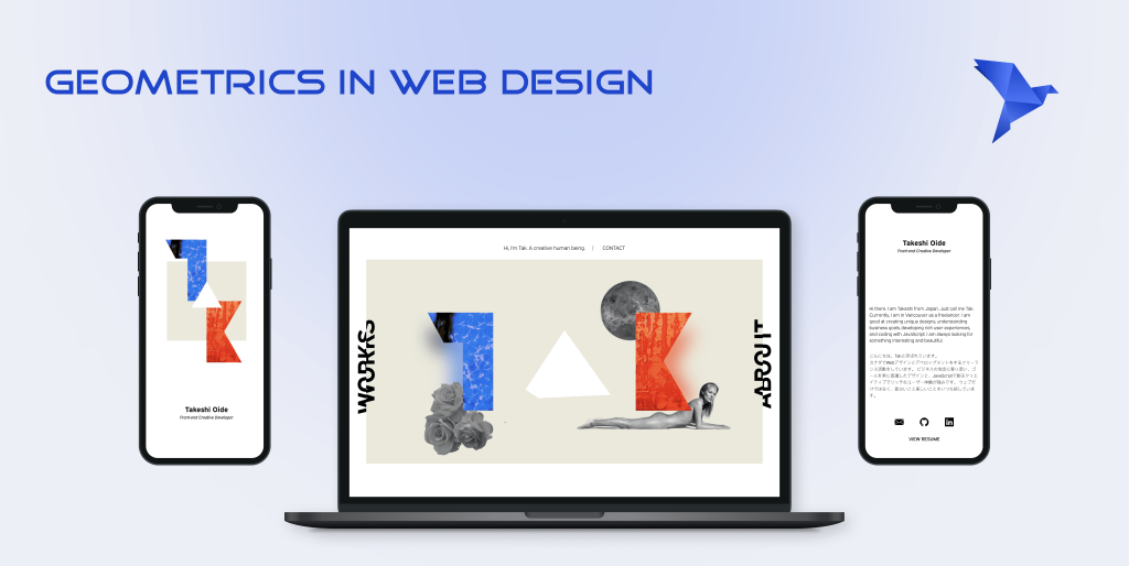
“Hi, I’m Tak. A creative human being…”
“This is our latest example of the geometric style for today. This is an atypical version of a website portfolio. However, it does not look old-fashioned due to the interactivity of the figures and the constantly rotating triangle.
History moment
With the appearance of the first people on the ground and the development of the Neolithic epoch (from 10 to the beginning. of 3rd. BC. e.) geometric style is considered to be its work of stone and the development of the culture of ceramics and painting on it. The popular form for dishes and jars was considered the “lush” figure of a woman, which was the forerunner of fertility. And the painting was geometric ornaments with clear and bright forms of the main decorative elements: lines, circles, squares with rhomboids or zigzags, and so on.
Special human perception of figures
Interpreting such skills in 2022 on a web canvas by a designer has long become a chip for the perception of the ordinary user. However, the introduction of such technologies is also connected with the psychology of human perception of figures. For example, people perceive a triangle as cyclic, that one angle is the next. And in practice, the triangle opens windows for a tip or flips something.
Concept
The geometric style and its conceptual idea became entrenched in the presentation of strict geometric shapes, such as a square or even a hexagon, and other shapes without outlines. Basically, to emphasize them are used bright and interesting for perception combinations of colors. Interactivity, shadow effects, overlay, and transparency of shapes are also used in the design.
The main pros of this style are:
- Shaping and volume shapes
- It attracts attention and is associated with clarity
- The positive influence of geometry on user perception looks logical and natural. We are surrounded in life by figures
The main cons of this style are:
- Some people think it’s obsolete
- The boundary between geometric style and futurism merges
- Using rectangles, squares, and circles is so routine, so if you add all the geometric design to it, it can ruin everything
Finally: How To Proceed?
The author’s style is visible from afar. However, if you doubt your abilities, it is never too late to study the material, read the articles or consult experts. And to find your reflection and understand which of these alternative web styles suits you best, let’s do the following.
Get more opportunities in website and app development
Our company “BramlingTech” takes care of any design of your future website company, brand, or business. Our experts can help you determine your individual company style with the website development, testing, and selection of a shitty domain and host. You can read our portfolio here. Fly your design into the highest level with us. Because we love to provide senses to content.