

Creating a website or an e-commerce source, you have to decide how you will display it on different devices. According to Statista, more than 50% of web traffic comes from mobile gadgets. That’s why you should make it responsive or adaptive so that users can conveniently use your site on a computer, tablet, or smartphone. But which one is better to choose? Examine the positives and negatives of responsive vs adaptive design. Take time making a choice because the rework will cost you dearly.
Responsive design
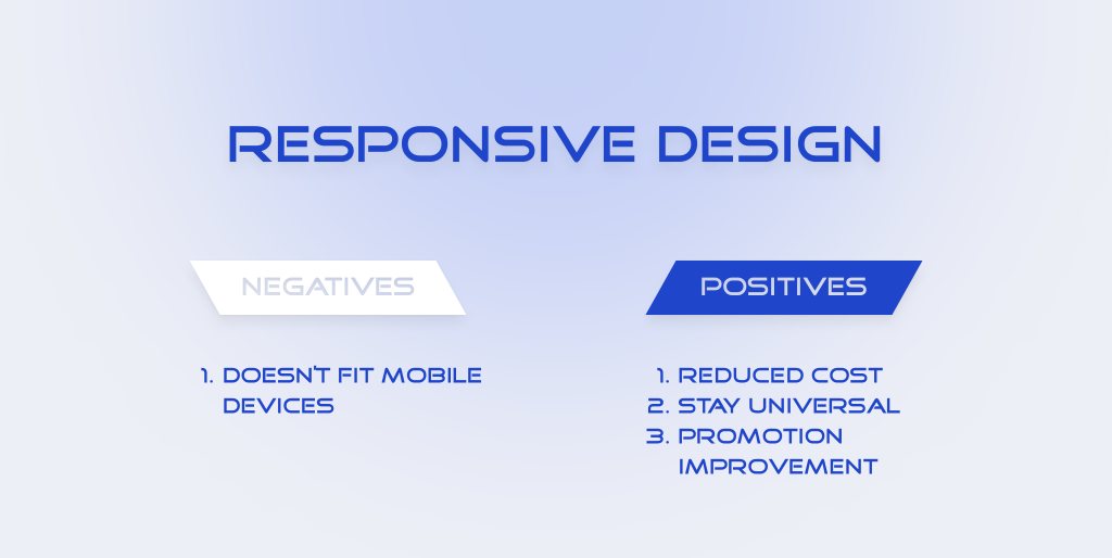
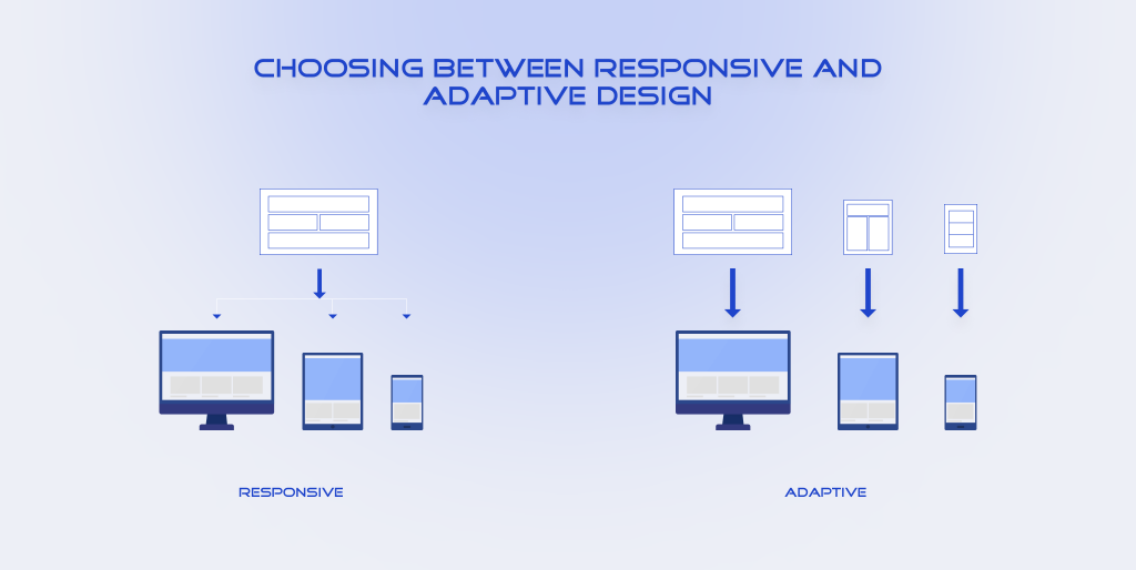
It allows you to resize your site for any screen. This variant does not offer much control because you cannot change the position of objects as you want. But you will spend less time and money to implement it.
Positives
Reduced cost
You create a single version of the interface for any display resolution, so you will pay less for development. As you do not need to make a design separately for each device, developers and designers can make it faster. You can also reduce the cost of maintaining it because a responsive site takes less work. If you need to update content, you can do it simultaneously on all devices.
Stay universal
The pages of the website will look the same. Menus, buttons, text, and images stay unchanged. It helps users to find what they need quickly and intuitively.
Promotion improvement
Responsive websites have a single URL, which helps with SEO optimization. You do not have to redirect from one URL to another.
When your site has a separate mobile version, then it should also have a high level of trust of search engines. Therefore, you will have to do more work to promote it to the top of the SERPs.
Negatives
Doesn’t fit mobile devices
This design is convenient for laptops and computers. But when a user visits a website on their smartphone, they often see an overloaded with unnecessary elements page.
For example, the mobile version can lack a navigation menu. So, if you have important elements like tables and graphs, there’s a chance that your clients won’t see it because of the missed menu elements.
As a result, the mobile user will see an incomprehensible interface on their screen. If they do not figure it out, they will leave the page.
Adaptive web design
It consists of different layouts that a developer builds for the specific size of the screen separately. It allows you to personalize the displaying of the site depending on the device.
If you have not yet fully understood what adaptive design is, then take a look at its positives and negatives to decide whether you need it.
Positives
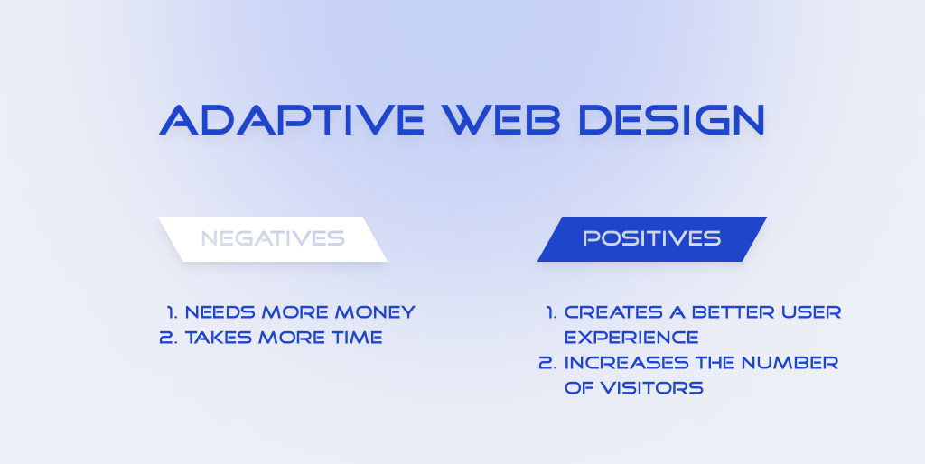
Creates a better user experience
Your sales depend on the comfort of the buyer. Therefore, it is important not to give them reasons to abandon the page. Adaptive design pattern helps enhance the user experience by optimizing the displaying of content for the parameters of each device.
You can analyze how a customer behaves using a particular gadget. And then improve it so that the user does exactly what you want them to do.
Increases the number of visitors
Adaptive web design improves page loading speed and ensures their correct displaying, as well as proper switch and stable operation of all functions. The better these metrics are, the more users will stay with you.
Negatives
Needs more money
If you decide to choose this variant, remember that you have to develop several versions. Usually, you should create at least 6 patterns so that owners of iPhone, Android, iPad, and other popular gadgets can quickly find what they are looking for. Therefore, such development requires more serious financial investments.
You have to find a team of qualified designers and developers who work with different types of devices.
However, you will get a unique and high-quality website.
Takes more time
Сreation of separate versions increases development deadlines, so you need to predict more time for implementation. If you need a website urgently, then you should rethink your priorities.
Choosing Between Responsive and Adaptive Design
There is no single answer as to what option is best. Each case is individual and requires a professional estimation. We can give you some recommendations to help with a decision.
Analyze your target audience
Explore which devices they generally use. Does it make sense for you to invest in adaptive design if the customer prefers to visit the site from a laptop? In this case, a responsive variant is enough. But if potential clients are looking for your products or services using a smartphone, it is better to think about their convenience. You can save money now, but you will lose sales in the long term.
Analyze your content
How much content and different elements are there on the pages? Do you want to add tables and graphs? If you plan to place a lot of pictures, text, videos on the site, you would better choose an adaptive design.
Define a budget
How much money can you invest in this project? If you do not have enough funding to create and maintain an adaptive website, think about a more economical option.
Determine the urgency
Do you have strict deadlines or do you have a lot of time? Сomparing the speed of creating adaptive vs responsive designs, the first one will take you more time.
If you still doubt which is the best choice, analyze your competitors. What method do they use? Go to their sites from different devices and see how they implemented the functionality.
Responsive Design vs Adaptive Design Examples
We have prepared a few brands that applied these patterns. You can study them to see what works best for you.
Responsive web design examples
Dropbox
The site has a flexible structure and changes color depending on the background and position of the image. It is convenient to use it regardless of the device.
Magic Leap
Magic Leap has developed a simple website with a focus on mobile first. The design is minimalistic so it easily adapts to all the screens.
Adaptive web design examples
Nike
Brand Nike changed the menu for the mobile version, it is more extensive on the desktop site.
Maplin
Their responsive site is on a separate mobile URL. It detects the type of device and redirects visitors to the appropriate version of the site. Thanks to this design, customers can easily browse the product catalog and comfortably make purchases from their mobile gadgets. They change the displaying of the menu in header and footer to make it more user-friendly for smartphone users. They transformed the list of popular categories into a compact slider so that it takes up less screen space.
Summing It Up
You can reduce your costs if you implement responsive design. Its realization will also take less time. But it is not a perfect solution when you have a lot of elements on your website. Moreover, it is better to choose adaptive design if your clients prefer using smartphones when they visit your online store.
If you cannot make the final choice on your own, then write to us to get our advice and expert opinion.