
Whether you know when the first site was established and designed? The website info.cern.ch celebrated its 33rd anniversary and still exists in its original form. The World Wide Web was invented by British scientist Tim Berners-Lee in 1989 while working at CERN, according to official information. All right, early sites were more like a table of textual data than the beautiful interface of today.
Breakthrough that helped to improve the accessibility of content
HTML tags defined headers’ true size, color, and location and performed the most primitive multi-column layouts. All happened at low Internet speeds. Later, with the invention of CSS (Cascading Style Sheets), one of the programming languages, become easier for designers to control the site’s appearance due to the more complex HTML mechanism. This breakthrough helped to improve the accessibility of content to the audience and provide greater flexibility in the specifications of the presentation. What does that mean? Pages start downloading faster, and the web chain began to weave us much stronger. There is also an initial professional division into developers, designers, and copywriters.
The web design renewal
It is connected with the introduction of Flash technology in 1996. This interactivity opened for creators new features, such as changing the color of menu navigation, using a simple layout, painting tools, 3D buttons, and “tiled” background images. However, in 1998, the world-renowned American newspaper The New York Times named one man as the “website usability guru”. And for a major reason. This was Jacob Nielson, a Danish researcher of human-computer interaction. The expert conducted his research “Designing Web Usability: The Practice of Simplicity” which proved that web users want to find what they need quickly, but if they do not know what they need, they nevertheless want to quickly view and access the information they face, logically.
New requirements that design trends dictated for the website
And the requirements that design trends set for the site of that period became more complex and clearer: intuitive content placement, the rejection of kernel colors, a simpler version of navigation, the study of color at possibilities, and much more. Are the styles of sites become slightly different from one another? Okay, let’s have a check underneath, right after the new view of the design trends from 2022.
ACTUAL WEB DESIGN TRENDS IN 2022
It’s important to realize that modern web design trends aren’t fixed in stone. You are welcome to follow these standards and tips, but you are not required to do so. A thread that units of emerging web design trends can be described as instead of dreaming about advanced technology, web designers are investigating new elements of reality. In a way that has never been done before, they are blending the digital with the actual world.
TOP 5 BEST WEB DESIGN TRENDS IN 2022:
- Return to 90s fashion. There are many who aspire to an idealized past in these difficult times.
- Using gradients. When you are creating individual elements with gradients it allows you to select objects and catch the user’s eye.
- The concept of neomorphism. Usually, the result is similar to a numerical embossing or deboning.
- Fonts with serifs. In the past, the use of serial fonts on websites was considered an error.
- The parallax effect. It is an optical illusion in which objects near the spectator move faster than more distant objects.
As a result
The upcoming website design trends for 2022 truly breathe fresh life into the world of information technology. The goal of any entrepreneur is to create a distinctive site that looks original and is remembered by users. Well, you also can read full information about them in our blog.
WEB DESIGN STYLES: FROM CLASSICS TO CREATIVE DECISIONS
SKEUOMORPHISM (REALISM): DOES IT EVEN EXIST?
Skeuomorphism (Realism) in web design is a style, which is mainly used in graphic design in the process of creating an authentic user interface. The term from the Greek language is composed of skeuo- (σκεῦος), which means “vessel or object of influence” and morph- (μορφή), which means “species or form”. Quite simply, so that the website viewer understands what he is interacting with on the site. This object in the digital world though has its analogy in real life. For example, even an item in a shopping basket transmits the direct destination of any purchase in the real store.
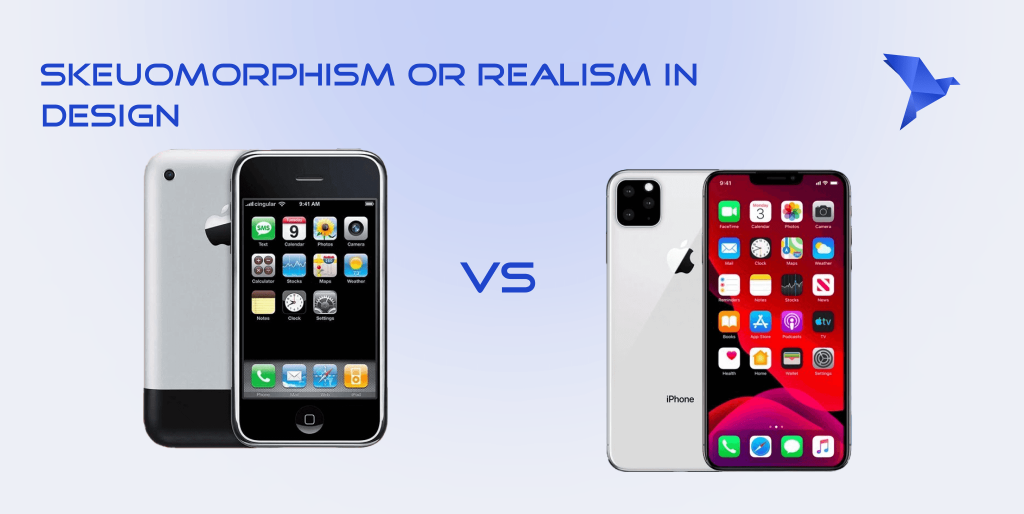
Or like the older versions of the mobile version of the iOS Apple operating system for a reason frequently practiced principles of skeuomorphism also spelled skeuomorph. Does nothing resemble the icon of a brown, like a “paunchy” TV from the 20th century, and a calendar icon that literally looks like it can be easily flipped over, as in life? All of this explains that skeuomorphism in iOS has been widely considered and has been an element of the human approach to a new generation of phones. Oddly enough, for people, Apple’s mechanics seemed easy and intuitive. That was the key.
History moment
In the 1980s, during the hot period of software development, the advent of personal computers in users’ homes marked the beginning of a global change. What contributed to such a quick and easy transition of users? The British scientist, doctor, and amateur archaeologist Henry Colley March decided to patent a new term for humans “skeuomorphism”.
An imitation of the analogy of digital objects to what we usually see in real life. Naturally, such associations help cope with the complexity of using something. The same has been done historically and with this concept. It is not necessary to feel the object to understand how to adapt it to your life activity.
Concept. Simplicity, depth, and interaction with the “spectator”
As we mentioned above, the concept of skeuomorphism in web design is synonymous with realism. With the help of light, shadows, 3D elements, and elementary saturation of images it is possible to achieve the desired effect of displaying reality.
The main pros of this style are:
- The user understands you with half a word
- A convenient and enjoyable way to present your product
- You can put a “live” digital form of your content on the site
The main cons of this style are:
- Many see it as outdated
- Lack of individuality and special creativity
- Reduced site performance due to interactive elements
MINIMALISM: IS IT SO SIMPLE?
Minimalism in web design is a style, which was a counterweight to the previous one. As they say, there is beauty in simplicity. The term consists of the word “minimal”, which explains hence its brevity and limits. With the forgoing unnecessary details, avoiding the huge variation of site colors and other redundant solutions for the idea of this style.

An example of demonstrating minimalism is the site of the famous network of the Spanish magnate Amancio Ortega — “ZARA”. On the home page, you will not see thousands of discount offers, which is typical for such companies — just conceptual pictures of models in designer clothing. Also, categories of goods are hidden in a side console, on the main page, there is only a search box, and the ability to register and make a purchase. It is not clear whether this is a good solution for the mass market, which should mainly sell, not “inspire” referrals. And the quality of the images leaves much to be desired.
History moment
Why do Americans always simplify everything? Minimalism as a form of abstract art was invented in the United States in the 1960s. And if you’re thinking about Malevich’s painting first, I have some bad news for you. Firstly, the artist was not an American, but a Ukrainian Kazimir Malevich, and secondly, it is suprematism. However, our style in this period is also remembered ‘cause of its elementary strokes, squares, rectangles, and points.
With the advent of the first websites of the 2000s, minimalism began to appear quite often in the portfolio of designers. And the long blue links, the huge amount of 3D elements, and other “garbage” came to an end. How long have you been saying “Okay, Google”? Of course, the Google search engine is also minimalistic in its original form.
Concept. Minimalism aesthetics is using limited details and having a “pure space” on the site
It is certainly a profound meaning that a person who is using just a few words can perfectly imagine himself. The greater the weight and meaning of words, the greater the result in actions. And wait, it is not only about the person, but about the concept of the site.
Okay, so more free space, just a couple of colors and fewer elements, and my website design ready? It’s not as simple as it looks, wait.
The main pros of this style are:
- It is part of art and has a modern look
- Good performance and fast page loading
- The selection of the main accents contributes to the growth of traffic on the site
The main cons of this style are:
- The minimal functionality
- It’s hard to make a website unique
- The user can get lost in the creator’s impulse and leave the page without answering his question
BRUTALISM OR JUST DIGITAL ANARCHY
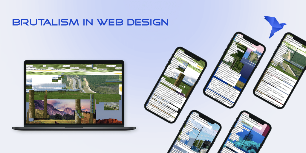
Brutalism in web design is a literally raw style. A bold solution in the form of bare long links or absolute anarchy on the home page. The meaning of this term came to us from the French language sounds like a (béton brut-), which in translation means “raw concrete”.
History moment
In its original form, the style refers to the post-war period of architecture, originally in the United Kingdom. Breath from the ’90s? The starting point of the periodicals of brutalism considers the 1950s and 1970s. Its coverage due to the simplicity and cheapness of construction spread throughout Europe. Have you seen the “Salute” hotel building in Kyiv? Here’s something like that.
Nevertheless, if we speak about the web style of brutalism, it is definitely not the development of one person. This is a collective vision of the ideas of designers around the world that decided to revive it digitally.
Portfolio of Brutalistwebsites
More recently, in 2014 the creative director of the agency Freundliche Grüsse Pascal Deville decided to create a portfolio of brutalistwebsites.com. It is obviously very similar to the coarse form of typography, which we will deal with later. Why do sites look like they took less than 15 minutes to build? This is a challenge to classic-sculpted styles and breaking stereotypes about which site should be practical for the user.
Concept. The idea is that the Internet web is still cobweb based on the design of your site
It is quite a bold solution, but it is exactly creative. As in the example, we saw chaos on the pages, basically, it is that the site as a raw stone appears before the human machine. Underlined references, images without textures, shadows, gradients, and text alignment seemed to be deliberately ignored.
The main pros of this style are:
- You stand out with this site chaos among the competition
- It’s not that hard to make it happen if you’re not careful with the structure
- There is no need to create a hierarchy of components, a complete lack of symmetry, and other details of brutalism in web design
The main cons of this style are:
- It’s hard to quickly inform a visitor to your site
- The design of the site is more like a draft or sketch, rather than a finished site
- Protesting from structures and styles that have worked in the past with 100% success is not always a good solution
FINALLY: HOW TO DECIDE?
So many styles, but they’re still so different. Sometimes it’s hard to understand even how relevant a cat picture is to the sale of blankets and how its quality can affect your web traffic. What can I say about what style is now in 2022 in trend and not a “suction site from the 90s”?
The answer to this is straightforward
Our company “Bramling Tech” takes care of any design of your future website company, brand, or business. We will help you with the development, testing, and selection of a shitty domain and host. You can read our portfolio here. Get more opportunities in website and app development. Fly your design into the highest level with us. Because we love to provide senses to content.