

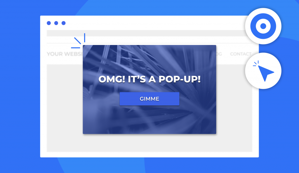
Pop-ups are probably the most widely used and the most effective way to attract a potential client to your web page. But how can you do it? There are several key points you have to know to create successful pop-ups for websites that will probably make the UX better.
Designing a cool, eye-catching pop-up requires attention and understanding of your client’s needs, comfort, and motivation. Here are 5 ways to improve your pop-up game and get a user-friendly, effective tool for your site. But before we get into it, let’s take you on a quick tour of pop-ups and the essence of using them.
What’s a Good Pop-up?
Pop-ups can have a positive effect on audience engagement using only two major rules: when the designer knows the audience, and the developer creates the perfect mechanism. A good and useful popup works if you put people’s preferences first and follow their needs. Though, it takes much more time and effort to do it than to say. But don’t worry, we’re here to give you some hacks. The diversity of pop ups for websites and the results you can get by using them might be quite surprising.
To make a long story short, here are issues that a proper pop-up can solve:
Conversion
For online businesses that sell services or goods, it is important to make targeted actions. A pop-up with the right information and catchy design can easily turn your site into a huge selling hub.
Promotion of the brand
The main goal is to engage the user and keep them on your website or app. A pop-up that appears at the right time and in the right place can do it.
Saving time
If a person can subscribe to notifications without registration, this will increase their loyalty. At the same time, you get a new subscriber and potential client.
According to Sumo research, the average conversion rate reached with a pop-up is 3.1%. At the same time, the effectiveness of a thought-out, good pop-up can bring you around 9.3%. Doesn’t it sound cool?
Types of Pop-ups
Usually, there are two types of pop-ups: hello-board and page-stop options. Yet, these pop-ups can also be arranged into several categories. Let’s get started with the basics.
Hello-board pop-up
This kind of emerging window doesn’t limit the user’s actions with the webpage and has no strict placement. For example, this pop-up is often displayed as a narrow band at the top or bottom of the site. It is easy to close, and it doesn’t interfere with page viewing.
Page-stop pop-up
It usually appears at the center of the screen and covers the whole page. A user can’t close or skip it until they do any targeted action. To be honest, the websites with pop-ups of this type aren’t the most comfortable for a user but are very effective.
Pop-ups also differ in their purpose of use and display conditions. Let’s see the main options for using them.
Entry pop-up
When it appears: It comes out on the page immediately and blocks content before the visitor sees it. In other words, it’s a typical hello-board pop-up window.
| Pros: | Cons: |
| •Guaranteed to grab the attention of users. •To remove the window, the visitor must perform the required action or close the pop-up manually. | •This kind of pop-up is not suitable for collecting leads or redirecting users to a landing page. •Most users will simply close a site that has not yet provided any useful information but already requires some action from them. |
How to use it: Most often, welcome or entry windows are used for emergency communication with visitors. For example, to notify about technical problems, invite to an event, tell about a major update. If you decide to use a welcome window to attract subscribers or receive an application, make sure you put something useful on it. It can be a sale announcement, promo code information, etc.
Timed pop-up window
When it appears: It emerges after a certain interval.
| Pros: | Cons: |
| •You can set up the time for a window to appear. | •You probably can never be sure about the perfect timing of this pop-up. |
How to use it: A timed pop-up is a great variant to provide information, ask to subscribe, offer to see other site tabs (based on users’ interest and behavior). The only thing is to figure out when it is the best time to use it.
Scroll pop-up
When it appears: It comes up when the user scrolls a certain percentage of the page. Swipe is usually set to 40-70% read.
| Pros: | Cons: |
| •You can show the user an offer that is most relevant to the content being viewed. | •The downside of a scrolling window is that you can easily overshoot with the average page scrolling by the user. |
How to use it: When using the scrolling pop-up, you can ask to share content, tell users about news and current promotions, offer a subscription to the newsletter. Use statistics on average page scrolls to determine the best time to show a pop-up. You can also use the data of thermal imagers for websites when you set the conditions for a window to appear. With the help of thermal imagers, you can see how visitors behave on the site and to what point on average they scroll the page.
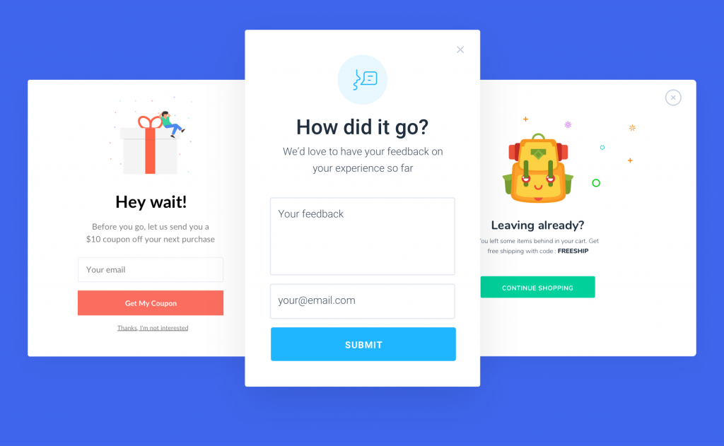
Exit pop-up
When it appears: Usually, it displays when the visitor is about to leave the site.
| Pros: | Cons: |
| •The pop-up helps to hold the visitor back by offering to subscribe or provide a phone number to call back, or just to see another tab. | •Can seem annoying for some users since it doesn’t really provide anything in return. |
How to use it: The point of using an exit pop-up is to keep the visitor’s attention. You can use it to give additional information, offer users an opportunity to contact them after a certain period of time.
Click pop-up
When it appears: It generally shows up when the user makes a certain targeted action. For example, clicking on a link or button.
| Pros: | Cons: |
| •This type of window saves space and allows you to create a convenient interface. | •If the user does not perform the necessary action to show the pop-up, then they will not see it. |
How to use it: Hints, descriptions, and feedback are the best aims that you can apply to a click pop-up. It allows you to make the user interact with the page and therefore you can get needed data. However, you should also create a strategy that will necessarily make your potential client see the pop-up.
Reasons to Use Pop-ups
There are a lot of types of pop-up windows, and it is simply impossible to describe them all in one article. But we can still list reasons why you should pay attention to this type of site boosting.
- Lead generation
A pop-up window consists of two parts: information or an offer for a client and a form in which users can type in their phone number or email. This helps a business to build communication with potential clients and push them along the sales funnel.
- Informing customers
Website popups can be used to announce new products, news from the company, or to tell about promotions and discounts. It’s a perfect way to attract clients. They do not need to look for information on the site, instead, you save them time, inform them and offer to communicate with a manager immediately.
- Keeping a visitor on the site
You can configure pop-ups to appear when the user closes the site. In order to interest and retain the visitor, the pop-up offers motivation: a discount, a free information product, or any other thing that can motivate a user to make an action.
- Customer surveys
Using a pop-up, you can communicate with customers and find out about their attitude towards the company and its products. When organizing a survey, it is important to keep it small and understandable for each user.
- Creation of a subscriber database
If you create a pop-up with a subscriber option, it can help you to promote the social media accounts of the company and gain an audience.
5 Best Practices of Website Pop Ups
There is no one-size-fits-all guide to using pop-ups correctly. However, we can provide you with a few guidelines to help you use pop-ups effectively. How to get the best website pop up designs? What are the right formats? We’ll figure it out right now.
1. Use the Right Format
Make sure that your web page pop ups are simple. The overriding feature of a good pop up is its readability. We bet that you, as an active Internet user, have seen these floating windows with tons of text and non-aesthetic designs. Looks annoying, doesn’t it? Keep it in mind and don’t make the same mistakes when developing your own pop-up.
2. Serve Them Up at the Appropriate Time
The logic of displaying the window and its relevance to the current actions of the user is a real game changer. Your potential client shouldn’t feel bothered, that’s why it’s your priority to make the pop-up look natural. Doing tests will help you to understand are your popups effective or annoying.
3. Integrate Pop ups Well With the Rest of Your Site
If we speak about best practices of website pop up, remember that much of your traffic also comes from the mobile audience. The pop-up window must be fully displayed on the smartphone screen and be easy to view. Make sure that it is comfortable to view, use, and close.

4. Create a Clear Path
The most effective pop ups on corporate websites and other web pages have precise locations. This characteristic is also a key point to consider since it affects the chances of user interaction with your site. Decide with the type (hello-board or page-stop) and purpose of the pop-up window, and think about where it is better to locate it.
5. Include a Distinct Call-to-Action
Give your visitors an obvious idea of what they will receive by fulfilling your request. The user needs to understand what actions are expected. Good and effective pop ups on websites usually offer a user to “Subscribe to the newsletter”, “Go to the product catalog”, “Read the blog”, etc.
More Things to Consider
A well-thought-out design is what makes a pop-up useful and profitable. It makes 50% of the pop-up success, so there are some more points to keep in mind.
Use Color Blocks on Background Images to Increase Readability
The question of “how to make a great pop up for your website” can be answered with two words: simplicity and readability. And these words are connected as well. The design of a pop-up can be bright and colorful, but it shouldn’t be overloaded. If you have to put more than one sentence on the window, make sure it has color blocks for different types of information. Also, don’t put too much text on the template, and don’t use colors that don’t harmonize. It just won’t work.
Customize Design for Different Devices to Avoid Annoying Google
Creating a top sample pop up for a website isn’t enough. The pop-up window might be looking good on the desktop webpage option, but what about the mobile version? It’s no secret that most people use the internet from their smartphones, so optimizing a pop-up for the app or mobile web page is a must. It will also help to escape from being blocked by Google.
Use Fewer Input Fields to Increase Conversion Rates
Several fields can be interpreted by the user as an imposition. And the logical decision of the user will be either to leave the site or to not use the pop-up window at all. Keep it simple and use one-two fields for providing information. The less information you ask the user at the first stage, the more likely they are to go through the entire funnel. The first step in getting to know the brand should be the easiest one. Remember that the main rule of websites with good pop ups is simplicity.
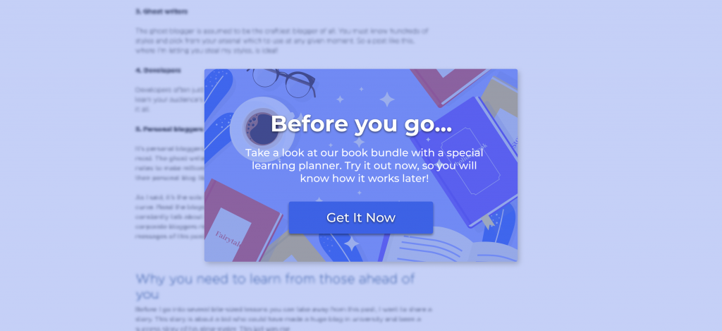
Make Use of Visuals
What is a good pop up warning for a website? It’s a concise window with a readable message. Add one image, a little text, a field to type in, and a button. Avoid design “emptiness” and make sure the window doesn’t look blank. Add some pop of color or a cool pic to attract attention. Also, it happens that a pop-up window on a website gets out of the general interface and looks like a throwback in the entire ecosystem. To avoid such a mistake, we recommend you ensure that the design of all elements on the page is matching.
Offer an Incentive
There’s no doubt that a newsletter subscription popup is a great idea, but let’s be honest: it’s old, and it doesn’t work at all. The way out in this case is a high-quality lead magnet in the form of:
- A promotional code for a subscription;
- Useful content / gift for a subscription;
- Extended trial period.
Some designers are stereotyped that they forget the importance of user experience. The pop-up does not have to include a form to sign up for updates by email or offer to go to social networks. Standard scripts don’t appeal to audiences. They are outdated, ineffective, and negatively affect behavioral factors. Consider why do websites have pop ups? And answer with creative ideas. Think about the audience and try to satisfy their needs.
Make Pop Ups Easy to Close
Annoying popups are the worst way to promote anything. The user should not only be able to see and interact with the emerged window but also close it if they need to. Adding an “I have already subscribed” or “Thank you for notifying me” field is a smart step to make a pop-up even more comfortable to use.
Test Thoroughly
It takes many website popup examples to try before you achieve efficiency. Make sure that your pop-up window goes through a series of tests to avoid possible mistakes and errors before you launch it.
Examples of Good Website Pop Ups that Work
Do you want to see the best practices for landing page optimization? Here they are:

Tommy Hilfiger online shop has a nice entry pop-up that appears immediately after the page is loaded. What’s good about this:
- It gives a nice discount offer;
- Looks good;
- It encourages potential customers to subscribe and motivates them to make a purchase.

Another good example of a working pop-up window is the Shein site. The placement doesn’t interfere with using the webpage and doesn’t ruin the user experience. What do we love:
- Plain yet catchy design;
- Informative;
- Encourages you to make a simple action.

The NY Times website is a nice option of a timed pop-up window. It allows you to read some pages before you see an offer. Why is it good:
- Good timing;
- Appears at the bottom of the page and doesn’t distract you;
- Offers a limited option.
Summing It Up
In fact, it is not difficult to create an effective and working pop-up for your webpage. Think it over, consider the details (text, colors, etc), decide the purpose, and just do it. With the right marketing idea and a sense of ratio, pop-ups can be an effective tool that delivers tangible returns because they can answer questions or offer information and be beneficial to both you and your visitors.