

One of the most significant factors in determining the appeal of a network project is its usability. And initial impressions are typically what determine whether or not a person would return to a site or service. Simply saying, website user experience is one of the most important aspects of a source since it can either help or destroy the brand’s reputation. Let’s look at some basic and often ignored UX optimization options, as well as strategies to improve usability throughout the most critical phases of engagement with your website.
What is User Experience?
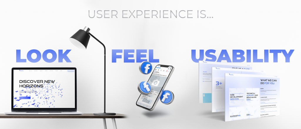
To understand what User Experience (UX) is, we have to remember the words of Don Norman, co-founder, and consultant of the Nielsen Norman Group and author of numerous books on improving user experience. He talks about how he worked at Apple for a long time, back when computers first became popular, and how they were thinking about user experience at the time. They stated that experience is when a person first hears about a computer, sees it in the shop, buys it, groans because he can’t fit this huge box in the car, gets it home, opens it, and stares at it with awe. Since all of these points of interaction with the product have an impact on the user’s experience, they were all grouped together as user experience points. Any interaction a user has with a product is a user experience.
The term “usability” relates to how convenient and user-friendly your website is for your consumers. The user should have no negative feelings after visiting your website. The fundamental idea behind the term is “user comfort.” When creating a website, you must focus on user experience web design. To make the platform work and bring you profit, you’ll have to figure out how to predict behavior and develop the process for carrying out the desired activity. When a website’s structure is simple for the user to go through, they can easily find the information they need, which contributes to the conversion and SEO of the site. However, a fundamental usability problem is creating an interface that is both clear and simple to use.
Why Improving the User Experience of a Website is Important?
It is apparent from the definition how vital it is to consider the habits of the target audience while building a new site. Conversion and traffic, the two most important metrics for improving user experience as well as site relevance, are closely related to how easy it is to use the site.
If we’re speaking about an eCommerce website, a sales funnel is a direct result of good usability. A proper arrangement of buttons encourages the user to do the desired action if the navigation has been well-thought-out and implemented. You may manage attention through the UI in the same way a salesman does through human interaction. You’re more likely to obtain a conversion if you assist and gently guide the visitor toward the destination.
Usability influences behavioral variables, which has a beneficial impact on attendance. If the user dislikes interacting with the resource, they will go to a competitor resource, and the money for generating visitors will be squandered. When a site is easy to use, all of the material is structured and helpful, and the customer scrolls through it for a long period, he or she is more likely to return. As a consequence, you not only attract clients but also improve your search engine rankings and enhance user experience.
10 Tips to Boost Your UX Game
In this section, we’ve described 10 website user experience best practices for you to explore and implement if you want to.
Website Performance Optimization
Shorter forms, a smooth checkout procedure, a clear navigation path, a strong call to action, and so on are all critical to your site’s success. Simplifying your site’s UI/UX is crucial, therefore do it right now. Before you compare your website to others, take the Google mobile test. Mobility, on the other hand, may not be sufficient to fulfill current market demands.
If your website is responsive or mobile-optimized, you’ll be able to get the most out of it on any device. An organization’s online presence should begin with a website that serves as a virtual showroom. It’s not uncommon for customers to make a purchasing decision based on the content of a company’s website rather than in-person interaction. The site must be mobile-friendly, clean, contemporary, and easy to use for this reason.
The contemporary speed of life is so rapid that if a user has to wait 2-3 seconds before the entire page-load of a website, they will quit it. Search engines require a fast page load time as well. Even if a few seconds don’t matter to the user, search engines do, and they reward the quicker site.
It’s all about Visuals
What today’s users desire is a design that is smooth, clear, and easy to read. If you don’t go overboard with video, animation, motion design, and other popular elements, they may be wonderful additions. A simple design will help improve the speed of your website load. And, as you know, speed is one of the most significant trends right now and will continue to be so.
When it comes to capturing the attention of clients, the colors used in website design go a long way. The site should reflect the company’s corporate identity and be connected with your brand from the first seconds. Corporate identity, appealing design, and high-quality content are the three pillars that maintain a site distinctive and one to which you want to return. Also, this can be applied if you want to make elements more obvious to your visitors. While creating a strategy about how to improve user experience, think about which buttons, sections, information blocks, etc should be highlighted.
The key issue is to establish a balance between the components and the background colors of the site. If the design is not packed with extraneous elements, it seems lightweight, allowing you to focus the user on the main part, and, most importantly, it is simple to browse.

Calls to Action Should Really Call to Do Something
CTAs (Calls to Action) breathe life into a website and are one of the best practices for website user experience. When a CTA follows a description of the offer, it’s obvious that the webpage is ready to give the stated service to clients. To make a page more engaging, include calls to action. Place a call button after the offer description for an improved user experience so that visitors can quickly view it and make a choice after reading all the information on the website.
Use an effective call to action to guide your site visitors to the next phase of their action. Prior to taking any step, new visitors should be educated about your company and its services or goods. Your goal is to motivate your visitors to take action and shape their desire to come back to your site later on.
Returning visitors may be more interested in information that reminds them of how much fun they had using the site the last time they visited. Loyal consumers typically seek convenience. They are familiar with your site and understand what they want and desire the highest level of usability. Find the best location for a clear call to action. Avoid using several CTAs in the same area. Increasing visual conflicts and decision points for customers is likely to lower your conversion rate.
Treat Mobile Devices with Kindness
Millennials, in particular, no longer want to be reliant on computers. With just a desktop version of your company’s website available, you risk alienating a significant portion of your target audience who are used to addressing all their problems on their smartphones. About 72% of users prefer mobile versions to desktop ones, while more than 60% of people access the Internet via mobile devices.
An adaptive site seems like a simplified smartphone version at first glance, with all the required user interaction features, but most of the administration tools are concealed. It is important to use adapted design to make sure that the content and page layout are both optimized for different screen sizes. When creating, the designers work from simple to complex: initially, they design a mobile layout, then refine and expand its features to a PC version.
Keep It Simple and Responsive
The website design should have a clear logical framework. It is critical that all parts are connected by a common idea, ensuring a seamless flow of material. Everything counts here, from the size of the header, font selection, color palette, to the style and color of buttons, spacing, design components, illustration style, and photo selection. All of this should come together to produce a unified and beautiful image. The uniformity and consistency of all aspects will help consumers to go easily from one design element to another and establish an effective user route.
Actually, a responsive website is a mobile-optimized version of the main site that changes size automatically to match the device’s display. The layout, pictures, and videos are “adjustable,” but the usefulness is limited.
Responsive design differs from adaptive design in that responsive pages adapt to the size of the device being used. Once adaptive resources have determined the type of device, they load the version that is best suited for it. This is not a tiny copy, but a precisely aligned page tailored to a certain phone, laptop, or PC model.
Customers are the Priority
In order to enhance the user experience, the appropriate IT teams should establish and maintain constant communication with the users. Despite its apparent simplicity, it is woefully absent in many IT companies today. The user is directly in front of us and fully under our control, so as we build these connections with our users and begin the communication process around a common objective, we must focus on the ways to improve website design. And only the users can give us a hint on what should we do for their convenience.
Since most users like interacting, it’s a positive sign that people are willing to offer open, honest feedback. This discussion benefits everyone involved, including IT professionals who want to enhance the experience of many IT system users as well as the users themselves, who will appreciate IT professionals’ efforts to make their lives easier, be more productive, and boost operational efficiency. When this collaboration succeeds, it’s fantastic.

The Category is Content
Here’s one simple rule you should add to the list of things to improve user experience on the website: the more text on your page, the fewer people read it.
Posting extensive texts is counterproductive; instead, stick to the 80/20 rule: 80 percent images and 20 percent words. Keep an eye on your articles’ layout, information substance, and literacy levels.
Use the following auxiliary components in your text design to make it easier to read and see:
- Subheadings are necessary to help readers quickly locate relevant information on the page;
- Lists with bullets make it simpler to understand and arrange the information;
- Useful tables with various colors to emphasize table rows so that data does not blend into a single field;
- A large, bold, and contrasting font style;
- Illustrations that help explain things.
Avoid making the user go to the search engine to find the data they require. They should have no trouble locating and moving between the pages they need. Also, the more enticing your headline is, the more people are likely to read your content.
Continuing our web design user experience tips, we advise you instead of focusing on your own needs, consider those of your clients. Analyze your target market and provide them with exactly what they want. Include relevant keywords in your texts so that people looking for your services may discover you easily.
Highlight Hyperlinks
Despite the fact that hyperlinks include text as well, they should never be mixed together with other text. Your website’s visitors should be able to easily identify all clickable components when reading the page. In addition, if your links aren’t visible because the backdrop is too dark, no one will click on them. While most websites apply color to emphasize links, this contrast is insufficient for color-blind visitors. A link’s presence can only be judged by glancing at the mouse pointer for those who do not notice the subtle differences in hue.
Adding a hover effect makes it clear to visitors which parts of the page are clickable. Clicking on a link that has an associated pseudo-element communicates the potential of doing so, and therefore helps to minimize the chance that the link will go unnoticed. You should always keep in mind that no matter how your users perceive color, they should be able to quickly identify clickable site components such as internal links. The hover effect is a quick and easy approach to meet your customers’ demands while also enhancing their overall experience.
Easy 404s
A lot of site developers don’t pay that much attention to the phrasing of error messages because they believe it is unimportant. But if a user is confused about what to do next once an error notice displays, he or she may decide to stop using your website at all. So, the message’s content can be simple while still providing customers with the information they need to avoid such problems in the future. Avoid using complex words and write in plain language. Information that the user can’t use shouldn’t be given to them. Even validation errors can be rephrased to sound kinder if necessary.
Navigation Like in a Shopping Mall
Navigating the site is similar to touring a shopping mall. A well-defined path, markers, and a catalog can help you find what you’re looking for quickly. The same is true for web browsing: the fewer clicks and steps you take, the more likely you are to stay on the site and get what you are searching for. Online navigation has a direct impact on bounce rate and conversion rate. Give your users a simple way to navigate your site, and they will be able to progress. And don’t forget to add this point to your website user experience checklist.

Summing It Up
We believe that now you know a little more about what makes a good website user experience. Remember that if you are promoting your business on the web, you must suit your clients’ needs in every way imaginable. If you want your visitors to return to your website, provide them with an amazing user experience by using one or more of the strategies listed above. This is the most effective approach to improve website traffic and conversions.