In the world of digital marketing, lead generation is a paramount factor for the composite success of your business. There are many ways to convert a neglectful prospect into an involved lead. Landing pages were created specifically for that purpose. In fact, businesses that had 10 landing pages and increased it up to 15, experienced a 55% increase in the overall leads conversion rate. That’s why you need to conduct your landing page optimization as soon as possible.
What’s the landing page?
In simple words, a landing page is where the user occurs to be after clicking on the ad. Typically, a landing page is an autonomous web page, generated precisely for an advertising campaign. Users “land” here after clicking on ads from social media, Google, or an email campaign.
Some people mistake landing pages for being the same thing as web pages, but there’s one main thing that stands out. Landing pages were specifically created to transform users into leads, and have one main CTA (call to action). They’re focused on increasing the conversion rates of the marketing campaign.
Main types of landing pages
Splash landing pages
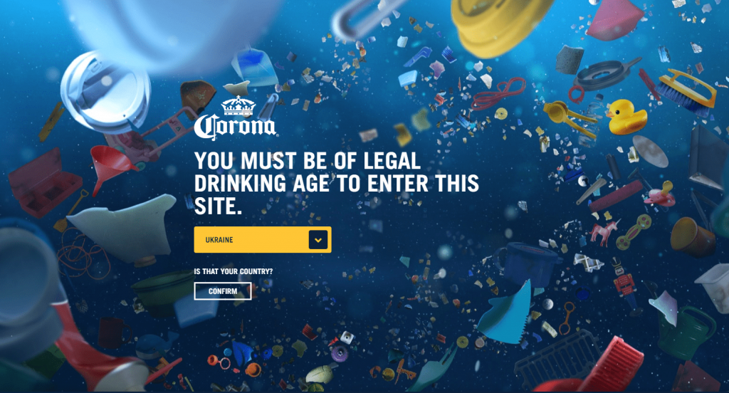
Splash landing pages typically don’t have an intention to convert users into leads at the primary goal. They commonly precede other web pages, like an announcement or a question to the user. Splash landing pages can ask users their language preference, region, or age verification.
Typical splash pages are designed in a very humble way, including only necessary elements, such as background image, and the transmitted message.
Squeeze landing pages
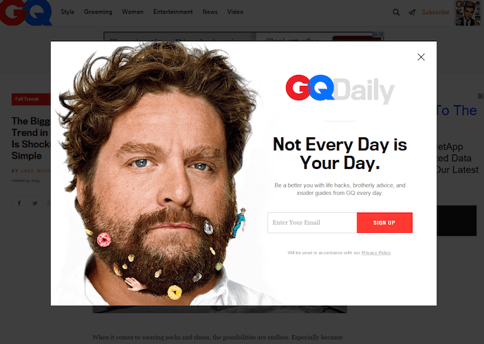
Squeeze pages are considered one of the best ways to collect users’ email addresses. They’re on the top of the marketing funnel methods and often provide free offers for exchange, such as guides, news, or books. Squeeze pages should be designed in a minimalistic way and can be created as pop-ups that instantly capture customers’ attention. If your goal is to possess as many emails as possible – try using squeeze pages as a part of your optimization strategy.
Lead capture landing pages
Lead capture landing pages are very similar to squeeze pages, and it’s easy to confuse them. Lead capture pages can be implemented for users that have already interacted with your website, and generally request more extensive information, such as name, business name, job title, or the industry he/she’s involved in. This type of page is commonly used due to its optimal length and the optimal quantity of the collected users’ data. The number of the fields should also depend on the level of the user’s position on the marketing funnel. The deeper user drives, the more information you should be able to get.
Click-through landing pages
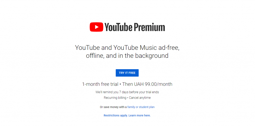
Every marketing expert will assure you that you need to provide value first, and in no case straightforward ask for money. The “Buy now” button often scares off new users! That’s exactly the purpose of click-through landing pages, which offer value for the user and share only relevant details about the offer. A typical example of a click-through landing page is an offer of the free trial, and after clicking on the CTA button, a user is redirected to another page that includes pricing details and requires entering payment information.
404 landing pages
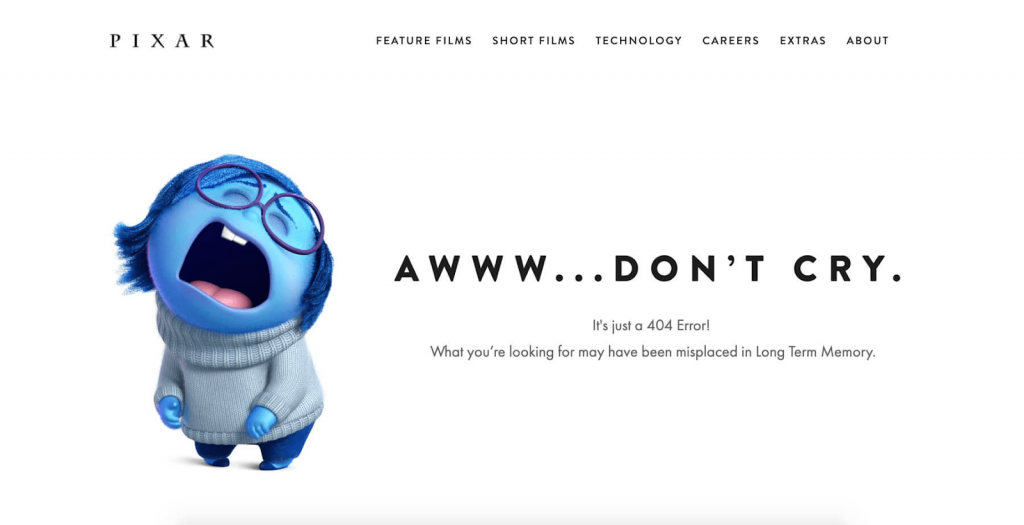
A 404 is a landing page with a great potential of converting lost users into loyal ones. Creative 404 pages can represent your company’s voice, humor and include interactive elements. In a perfect world, visitors are never supposed to land on the 404 pages, but that happens even with well-cared websites.
How to identify possible problems?
Before even considering your landing page optimization, you need to identify your potential problems. The first step to solving the problem is identifying it in the first place. Frequently, if the landing page doesn’t generate a proper number of leads, business owners can’t figure out what’s wrong and come up with the “genius” idea, “Change everything”, they say! Instead, many optimization tools and tips can help you improve customer engagement. A heat map is a great helper to identify what specific parts of your landing page need improvement. It shows where users click, and what areas they ignore. Heat maps are not the only type of visual report that identifies a user’s web page activity, there’re also confetti maps, overlay reports, scroll maps and all of them provide data-driven information for effective landing page optimization.
What’s an excellent conversion rate for landing pages?
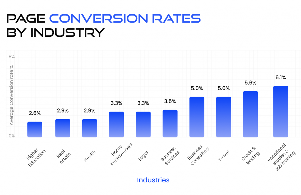
There’re no strict standards for landing page conversion rates, as there’re many factors that should be taken into account. Each specific industry or business has circumstances that differently affect conversion rates.
The typical landing page conversion rate is about 2.35%. The top 10% of sites are conversing more than 11.45%, and the top 25% of websites produce 5.31% and above. The best conversion rate significantly differs for different industries, and the golden mean average varies between 3-5.5%.
10 Landing Page Best Practiсes
So, you’ve already identified the reason behind your low conversion rates and came up with an understanding that you definitely need landing page optimization. Here are the top 10 lead generations landing page best practices.
1 Make a clear value proposition
Walk a mile in your target audience’s shoes and understand their pain points. What are they searching for? What values do they have? How to engage them? Your value proposition should encourage users and make them feel excited about choosing your proposition amongst all the competitors. Bringing clarity to your value proposition may have the greatest effect on your lead generation strategy. Analyze the requests users use to find your business and the goal they pursue, and use that as a headline. Make sure your language matches with your message, clearly state the offer, and enlighten enthusiasm.
2 CTA straightforward
Another top practice is reviewing your call to action. That’s not just a button! That’s a key to successfully converting prospects into leads. CTA should be action-provoking and trigger user’s responses to your campaign. Make sure your CTA has the proper size, clear statement, tempting text, and contrasting color scheme. Engaging design is a must for capturing user attention and provoking the action. In simple words, the audience comes to your website with a pain point or a problem that needs to be solved, and the CTA is a gateway to tackling the issue.
3 Add social proofs and testimonials
It seems so obvious that in the modern world, people commonly rely on recommendations and social proof. Supply users with social proofs like displaying the number of your downloads, successful projects, or happy customers. This will encourage users to join your loyal customers and build a trustworthy outlook for your brand. Providing real names and photos is a different way to establish credibility.
Adding positive or inspiring testimonials can be great for optimizing your landing page and increasing credibility. Try sending emails to your loyal users and ask them for recommendations, feature logos of your customer companies and implement that in your strategy. The statistic claims that 84% of users trust online testimonials as much as a personal recommendations.
However, if you’re looking for the easiest way, and consider faking the reviews, do not do that! People sense lies. Deceptive social proofs can smash your brand’s reputation and wipe out all the positive impressions.
Squarespace has a great example of a well-performed testimonials section. The page is defined in three sections, each designed in a fancy and aesthetically pleasing look.

4 Decrease page load time
That’s the golden rule – the faster your page loads, the lower the bounce rate. That’s non-negotiable, your webpage should load within a few seconds! Moreover, decreasing Remove the unnecessary elements, ensure all your images are optimized and each remaining element serves its function. Moreover, improving load speed counts as one of the best practices for optimizing your landing page and increasing your SEO ranking.
Take into account the Google PageSpeed Insights, where you can check your website’s load speed both for desktop and mobile options, and follow their recommendations to improve your performance. Adapt your website to the user’s needs or bid farewell!
5 Keep it simple!
“That’s been one of my mantras – focus and simplicity. Simple can be harder than complex…” – that’s what Steve Jobs once said. Creating a simple and consistent outlook can be harder than adding lots of unnecessary content. Cutting off all the redundant elements helps to create a better outlook and give a professional impression to your website. The modern world tends to be minimalist, not over-cluttered, and that tendency affects all spheres of our lives, like interior, personal style, social media profiles, and web design. From time to time, you need to step back and look at your landing page through the eyes of the user. What’s the first thing that draws your attention? What elements seem to be messy and vying for your attention? Simplifying can count as a lead generation landing page best practice.
6 SEO optimization
Some business owners still underestimate the pivotal role of SEO optimization. If you want users to find you through organic search, and get the highest ranking possible, you should provide the most optimal user experience. Search engine crawlers can be really demanding about addressing the organic search traffic to pages that can be irrelevant for the target audience. You need to use industry-related keywords, write attractive meta-descriptions, and provide an excellent user experience, hand in hand with quick as a wink page load speed. In reward, you’ll get landing page conversion optimization and new users from organic search.
7 Add contact info
Simply adding contact information can optimize your landing page and establish trusted relationships with your customer. We guess each of us had a situation where they felt frustrated and needed some help, but the website couldn’t provide it. Your contact number, email address, support chat, or link to the help center can assure users that you care about their experience, and you’re always here to assist them.
8 Review your content
However beautifully designed your website, if your copy is unclear and unconvincing, users won’t convert into leads. Joseph Sugarman said, “In the editing process, you refine your copy to express what you want to express with the fewest words”. If your main message is buried under tons of unnecessary paragraphs, users are unlikely to read it. To optimize your landing page, cut your copy in a half, then review it again and cut off all of the necessities once again. Strike the most important points straightforwardly.
Simplicity in design, copywriting and clear CTA is the best advice you can ever follow to improve the conversion.

9 Add videos for emotional resonance
You’re wondering what’s the most engaging type of content? The answer is the video! Videos are the best way to demonstrate your brand’s uniqueness and trigger an emotional resonance. A powerful representation is supported by the fact you demonstrate the experiences, stories, and people who’d experienced the positive influence of your brand. Recent research shows that watching a video assured 74% of users to download software or an app. The most popular types of videos for landing page optimization are explanatory and testimonial videos. For example, Slack created a great video that resonates with users, triggers emotions, and makes users feel related.
Slack // Work, Simplified (Director’s Cut)
10 A/B testing importance
Have you ever heard the parable of Buridan’s donkey? That’s about a donkey who couldn’t choose one of the two haystacks and died out of hunger. Making choices for landing page optimization is always hard, and that’s the reason why A/B testing was created.
In simple words, A/B testing provides you with data-based validation of your decisions. Each A/B test consists of two seminar landing pages with a single changed detail, and users choose which one is more convenient. The more tests you’d run, the more data you’ll gain to understand which assumptions work the best for your target audience. Create a list of your ideas for adjusting CTAs, design concept, button size, fonts, or color scheme, and conduct A/B testing to see which performs the best.
Summary
All in all, if you’re eager to create something cool, it requires time and investment. Landing pages are often the first experience of interaction with your website for users, and if you’re trying to increase the conversion and total engagement of visitors, landing page optimization is necessary. Creating a perfect landing page is no easy task, and all advice can be summarized in a couple of words: testing, simplifying, and improving.
Contact BramblingTech team and optimize your landing pages with a team of high-qualified specialists!

