

Website design forms the first impression of your company. It helps users quickly find the information and lead them to the targeted action.
Harvard researchers found that 46% of users build trust of the company based on their design experience. Ignoring this fact means losing some potential clients. If you want to understand how website design affects B2B sales, read this article to the end.
What makes B2B website design different from B2C?
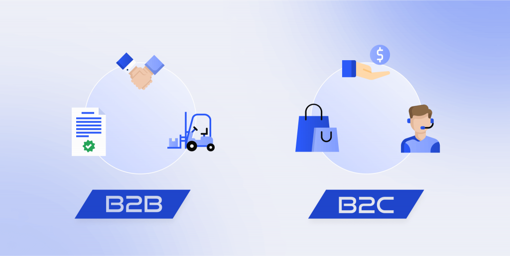
What is a B2B website? It is an online sale instrument of companies that sell their products or services to other businesses.
B2B and B2C customers behave in different ways when they shop. In retail, shoppers often tend to make impulsive decisions and buy on emotion. To make them act in the here and now, designers use a few tricks:
- bright buttons with clear calls to action;
- triggers in the form of a countdown timer, crossed out old price, a limited number of products;
- highlighting promotional offers;
- banners with a promo code and a specific expiration date.
The company representatives want to get the best deal on the market, so they choose more carefully and take the decision longer. They go through more stages on the way, from getting to know you to the action. The design looks more laconic and restrained, usually to emphasize information.
For B2B, it is more important to gain credibility and create a desire to get in touch with a company employee who will analyze their situation and sell it to them. Therefore, they often use feedback forms and offer to contact the manager. They add logos of partners or famous customers, quality certificates, awards on the main page to show reliability.
The cost of B2B products and services is often higher than that of B2C. Thus, some companies prefer not to indicate prices. But sometimes, it can scare off buyers, and they will go to your competitors. If you do not show prices, direct the user to take the next step to write or call you.
In B2C sales, one person makes a decision. In B2B, several people of different ages, gender, and post participate in the choice. For example, let’s say you sell tracksuits.
- If we talk about retail, your customers are women and men looking for sportswear to train. They can buy instantly without consulting someone else.
- In the case of wholesale clients, your sales can depend on the seller, manager, and director. It means that you need “to arm” ordinary employees with a lot of information so that they can convince management to cooperate with your store.
Five B2B website design best practices
Optimize it for mobile users
It is a mistake to believe that only B2C customers buy products from a mobile phone. According to Google research, the number of people using smartphones to shop in B2B has increased by 91%. If your site is not mobile friendly, you risk losing a significant number of potential buyers.
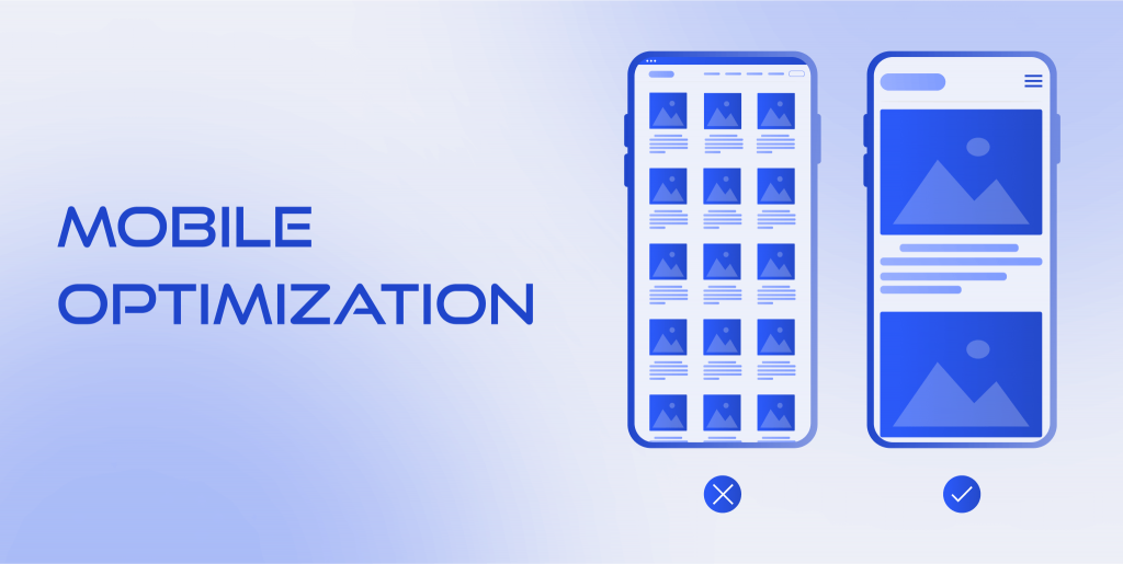
You have 3 ways to improve your design responsiveness:
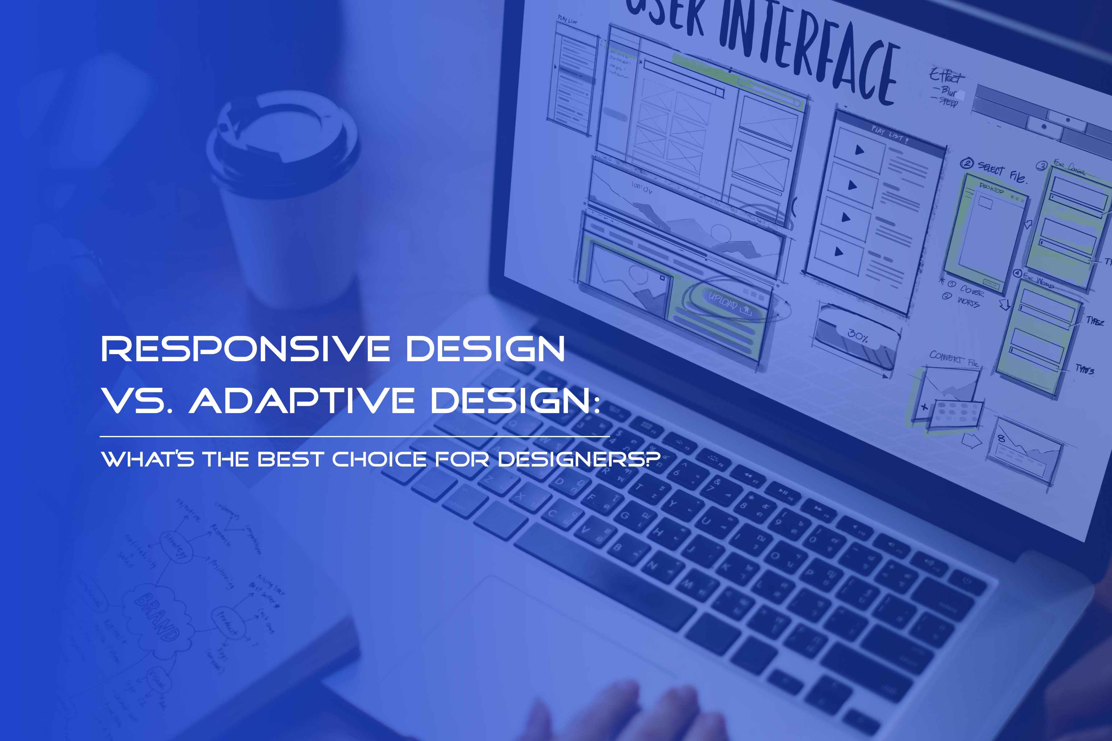
1. Make it responsive
Responsive design adapts to any layout. In other words, it can adjust: extend or reduce depending on screen size. If you do not overload pages with much content and do not use complex graphics, this option is good for you.
2. Create an adaptive design
An adaptive website detects the display resolution and loads the appropriate pattern. If a person uses a smartphone, they will see a design created specifically for this device. It allows you to change the content: add, delete or move elements to improve the user experience.
3. Develop a progressive web application
PWA combines the functions of a site and an application. An additional benefit of this solution is that the user can save your website to their home screen. Development of a B2B web application will also help you send them push notifications, increase download speed and provide offline access.
Add proof of trust
Company employees appreciate their reputation, so they prefer to choose trusted and reputable suppliers. What should you do to show that they can trust you?
Clients’ feedback and commenting
Ask clients to share their impressions of working with you in text or video. Offer them to tell what they liked, how you helped them, what problems you solved. Add their responses to the homepage. Indicate the name of the person and their position in the company if they will allow you to disclose this information. If you have a lot of feedback, display them as a horizontal scroll to save space on the page.
If you sell products, allow your customers to leave comments to express their opinion. Their positive experiences are social proof that other customers can trust you.
Famous partners and clients
Use the reputation of your partners and clients to boost yours. Put their logo on your site and show that they collaborate with you.
Awards and certificates
Add these documents, if you work in an area where this information is important and affects your reliability.
Successful cases
Select the clients whom your services or products have helped the most. Then post their stories describing their situation before working with you and how you helped them. You can create a separate page for each case if you have enough content.
Expert content
Create a blog where you can share useful articles and videos. Invite users to subscribe to the newsletter. You can make a separate banner with a call to action and a request to leave contacts. When they read a part of an article, show them a pop-up with an offer to subscribe.
If you have tutorials, conduct online webinars, or record video lessons for your customers, reflect this in your design. Insert a link to the appropriate page in the header or footer menu.
Add a chatbot to the home page, where the user can quickly ask you questions about the product, support, terms of cooperation, and others. Make the bot icon visible so that people can easily find it.
Use calls to action (CTAs)
Encourage your visitors to take targeted action that will eventually lead you to sales. Several tactics can help you increase conversions by creating the right CTA.
Free trial period
Offer to try your product for free for a short period. Users will study it and discover its benefits firsthand. It is one of the best practices for B2B websites that sell software, subscriptions, tutorials, e-books, and more. Conduct A/B testing to determine which term is best for your trial period.
Place a button with a trial offer on the main page in the site menu or on the first screen. Design it with a brighter color so that the visitor will immediately notice your CTA.
Shopify’s profits have increased 10x in a few years. The free 14-day trial played an important role in this.
Original colors
Use an unusual color combination to arouse interest. Many companies try to follow the trends of minimalism, which is why they lose their individuality. A laconic design has many benefits, but you need to complete it with accents to stand out. A visitor can easily confuse you with your competitors if they don’t know you well yet. Try to accentuate CTAs and key phrases with an Aurora gradient effect.
The brain loves to explore everything new. When a user sees an unusual color, it attracts their attention.
Gift or bonus
People love to receive gifts. Therefore, they often cannot resist when they see these cherished words. It is another way for you to get their contact details and take them to the next stage of sales. What can you give clients:
- a promotional code for a discount;
- free first consultation;
- additional service if they buy the main one now;
- a guide that solves one of their problems;
- free shipping, and others.
In B2B website design, e-commerce often uses pop-ups or a button in the right corner to offer a bonus.
Improve the outdated design
Your site influences the reputation and image of the company. If you haven’t updated its design since the 2000s, it is better to upgrade it. How do you know when it’s time to improve it? Explore some signs of old-fashioned design.
Too much text
When a person sees a large piece of text, they have internal resistance to read it. Complete it with graphics, pictures, subtitles, videos, etc.
Stock photos
Many brands use standardized images. But such photos do not establish credibility with the buyers because models look insincere and similar. It is better to pay a photographer and take real photos of your team.
An abundance of small elements
If you place a lot of different icons, pictures, and graphic objects on the page, it is difficult for the user to focus on the content.
Small fonts
Worst of all, if you use a thin and small font which complicates reading. The potential client has to make an effort to understand it, which they most likely won’t do.
Inconsistent and flashy colors
Red calls to action, brown menus, blue backgrounds, and multicolored elements make the site look gaudy. You block users from focusing on key information. Preserve a unified design style.
Provide easy navigation
Make it easy for the user to find everything they need. Do not overload the menu. It is better to create no more than 5-6 items or use a hamburger menu. You can also make it dynamic so that the user can quickly find the desired section. Think about the pages you can group.
Consider where to place links with contact information. Follow the best landing page tips and place them in the footer or header.
Make all navigation elements visible. It should be easy for the user to understand that a link is a link and a button is a button. Use a different color, underline, or bold to make them stand out. A person should immediately understand what will happen if they click on it.
Examples of B2B website design in different areas
Consulting
Sysdoc is a management consultancies association. If you look at their website, you will see a simple and modern interface. The company successfully uses B2B web design trends to make it easier for the user to search the site. Navigation is convenient. The menu field follows the visitor. All links and buttons are highlighted in another color when you hover your mouse pointer over it.
They added clients’ logos and case studies to the homepage to build trust with new potential customers.
Pavement design
Rollpark is an eco-friendly parking solution that is an alternative to asphalt. You can notice many examples of B2B website’s best practices that show the benefits and advantages of their product.
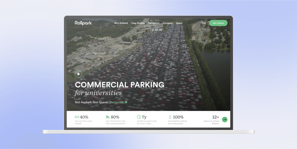
When you visit the home page, you see a video of Rollpark employees working. It also reflects the user experience of their product. It is a good choice to place it for the main screen because such content captures the attention of the viewers. The designers also used animated text on the video, which helped them save space and focus on important information about targeted audiences.
The principal value of the company is the care of nature. Green is a symbol of environmental friendliness. Therefore, they display icons, buttons, key phrases, and banners using this color.
Clear structure and easy navigation have been B2B website design trends for several years. Rollpark uses these methods to simplify the search and keep users on the page.
Summing up
Remember that your site needs to be mobile-friendly if you don’t want to lose a significant number of potential customers. Choose which design matches your needs best: responsive or adaptive. Or create a progressive web app.
Add information that helps you build trust with users who don’t know you yet. Motivate clients to leave feedback. Tell about your famous customers and partners if you can. Show your awards and certifications. Share your successful cases that demonstrate what problems you help clients with and what results you give.
Use best practices for B2B sites in content writing and CTA creation. Try offering visitors a free trial or a bonus for the contact details they give you. And then move prospects to the next stage of your sales cycle.
If you haven’t updated the site design for more than 7-10 years, you should improve it. Make site navigation simple and clear so that the user can intuitively and quickly find what they look for. People don’t want to spend a lot of time researching sites and finding information.