Having a contemporary website that was developed by using modern style web design is a must for every company. A business site gives exposure to thousands of potential consumers and enhances the company’s image and trustworthiness. Additionally, this site acts as a resource for consumers, as well as a showcase for the firm.
The quality of the design determines the success of the overall site. We must keep up with the times and know which tools are popular in site development today as well as which ones are deemed old and will be left in the dust.
Web design trends are always evolving; they are developing and updating to modern website design. Things that were relevant in 2016-2017 are no longer appropriate and are being replaced by entirely new things. A web designer or modern businessman must be aware of these factors so that the website’s final product is not only effective but also gives a positive impression of the firm that created it.
What are The Top Web Design Trends in 2022?
It’s important to realize that modern web design trends aren’t fixed in stone. You are welcome to follow these standards and tips, but you are not required to do so. A thread that unites emerging web design trends can be described as instead of dreaming about advanced technology, web designers are investigating new elements of reality. In a way that has never been done before, they are blending the digital with the actual world. As a result, the upcoming website design trends for 2022 truly breathe fresh life into the world of information technology.
The goal of any entrepreneur is to create a distinctive site that looks original and is remembered by users. Web design trends shift from year to year, so it’s good keeping track of them and incorporating them into new company websites. Take a look at some of the most recent web design concepts that are worth using.
Best Web Design Trends We’ve Discovered So Far
So, these are the design options that are currently loved:
It’s called the parallax effect
Parallax is an optical illusion in which items close to the spectator appear to move faster than ones further away. As an example, when we are driving a car and observing scenery outside the window. When the effect appears on online sites, it seems both genuine and surreal at the same time.
When viewing a web page, this effect creates the illusion of depth and space. When scrolling, elements that appear closer move more slowly than those that appear farther away on the screen. Sounds like a cool website design trend, isn’t it?
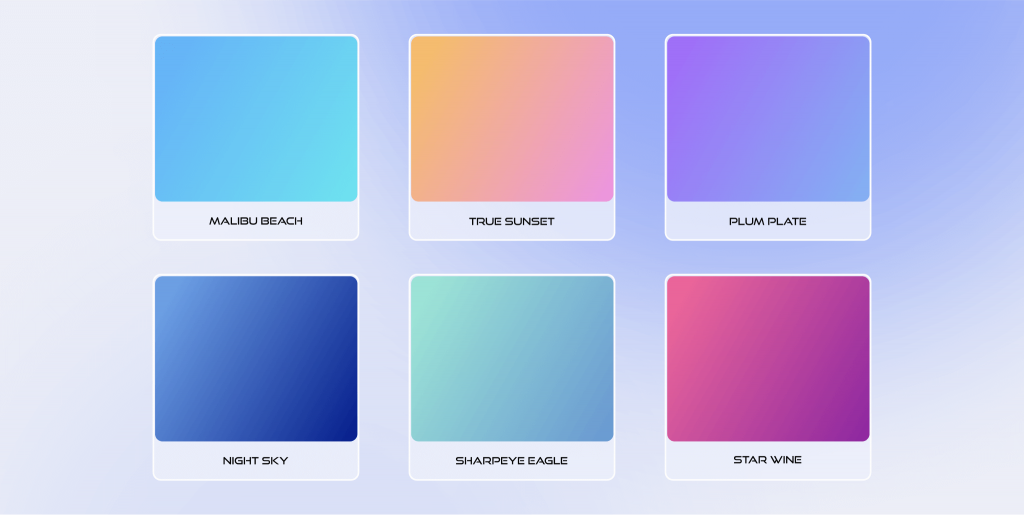
Using gradients
As a result, in the past, smooth color transitions were associated with amateurish, unattractive design. As of today, web developers are increasingly using gradients to create business. Using a gradient when creating individual elements of a web page allows you to highlight objects and attract the user’s attention.
The concept of neomorphism
Neumorphism is one of the top ongoing innovative web designs. It’s a synthesis of 2 styles where the volume of the object is mimicked by the employment of selectively falling shadows mixed with semi-flat hues. Most of the time, the result is similar to digital embossing or debossing. This technique enables designers to reintroduce tactile options that were lost during the flat design period, which improves the relationship between the user and the product. In 2022, we may expect to see this stylized realism in buttons, search, and text fields.
This style is the heir of skeuomorphism, a technique that presents the user with familiar but out-of-date real-life components. In the early 2010s, skeuomorphism thrived in-app icons.
Glassmorphism
Glassmorphism is also one of the latest web design trends that goes in sync with neumorphism. It’s one of the easiest and most intriguing effects to create and apply today. Glazed pictures, transparent components, and fuzzy elements bring the scene to life in a unique way.
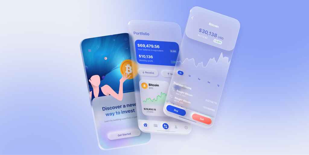
A frosted glass effect may now be easily implemented on websites thanks to the latest CSS revisions. As an alternative to gradients, this approach is often used by designers as a background. As long as it can be applied to practically everything, a trend will continue to grow.
In addition to being a “glass addition to the composition”, it may also be the primary character.
Images in SVG format
A broad range of devices, from small cell phones to large televisions with many tens of inches of screen, is currently used to view websites. As a result, the choice of graphics solutions and the design of websites are also affected.
More and more people are turning to vector drawings, especially when they’re done in the SVG format. Image quality does not deteriorate due to this format, no matter how large the display screen is.
Using muted tones
Our time spent in front of devices increases every year. Especially during quarantine and self-isolation, our eyes have little time to rest. Dark or light is no longer enough for site designers and modern web page design in 2022. Color palettes in natural greens, pastel blue, warm cinnamon, and light pink tones provided a center ground. Sites’ color schemes will be less harsh, and the user will feel more at ease.
Most individuals spend a lot of time on computers these days since the work market has been influenced by digitization. As a result, consumers commonly complain of eye strain. Color schemes that make it simpler to read are designed with this in mind by web designers.
Use the Dark Mode
This is a tendency that has been present for some years. As of 2022, there’s no sign that the page’s black backdrop will be gone for good. Dark, which dominates, provides beauty and functionality to the design, reducing eye fatigue for users.
Social inclusion
Despite the fact that this isn’t a trend directly connected to web design, social interaction has a major influence on web design, too. On top of dealing with the epidemic, the year 2020 has also been marked by protest movements throughout the globe. There has been a significant role performed by designers who develop socially relevant initiatives.
Scrolling with interactivity
An increase in the number of visitors to a website is another trend. Scrolling interactively reveals and hides components of the site, as well as changes their location and size.
Considering scrolling is one of the most subtle ways to engage, 2022 web designers are banking on the visual input users receive when they scroll. This can include a change in the overall color scheme, sophisticated animation transitions, and other significant modifications to the page. Web designers can make each scroll feel like a new page or even an entirely new site.
Fonts with serifs
Using serif fonts on websites was formerly thought to be a mistake. In part, this was owing to the poor resolution of the monitors on which they were shown.
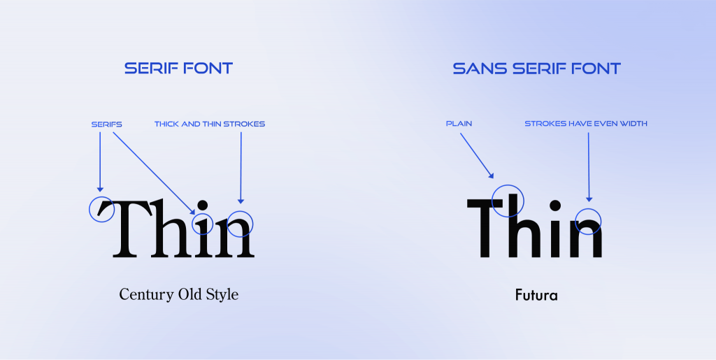
Today’s high-resolution screens on computers and mobile devices allow the use of laconic serif fonts that are elegant and minimal. But keep in mind that moderation is key. These fonts are typically used in page titles, giving a touch of traditional beauty to online designs.
Return to 90s fashion
Many people yearn for an idealized past during tough times. In the realm of web design, similar patterns may be observed. Designs influenced by the aesthetics of the 1990s are becoming increasingly popular across the world nowadays.
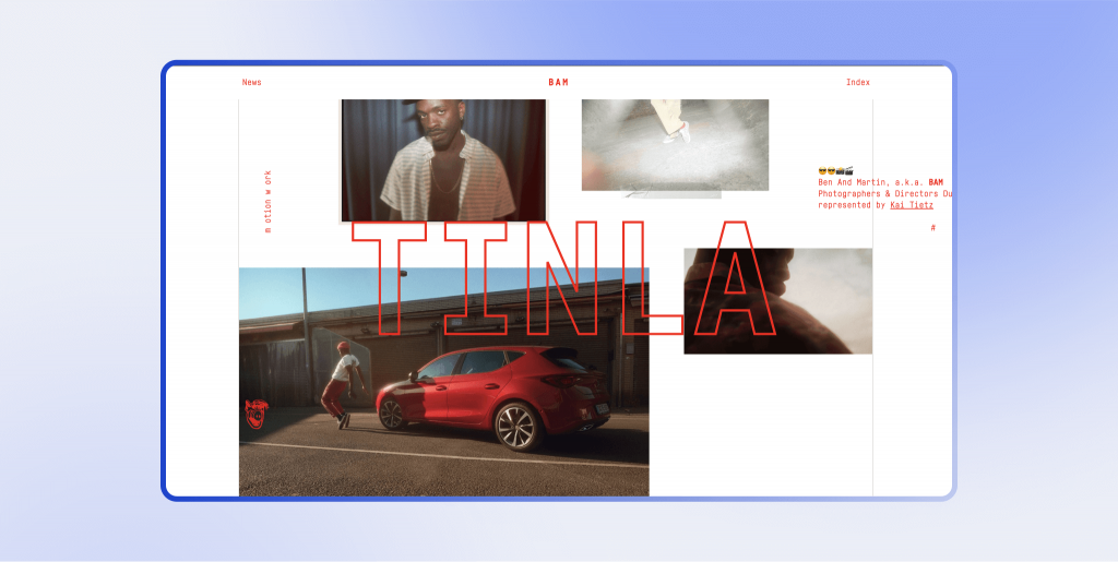
The ’90s design is defined by basic forms and color palettes that use vivid, humorous colors and black frames that are connected with the advent of the internet.
Web design shifts and asymmetries
Commercial sites were usually basic and symmetrical until recently. Today, however, this tendency is regarded as becoming increasingly repetitive and uninteresting. As a result, asymmetry and graphical changes dominate 2022 website designs, giving the website an entirely distinct and fresh look.
Brands are now focused on creating designs around their moral values and virtues, for example, around the efforts they direct to maintain sustainability, from measures to restore balance to the planet or to involve society in these problems. This means that brands are ready to use photos that reflect real, different consumers. It also means the growth of digital spaces where social issues will be talked about through interactive media such as visualization and simulation. And this, in turn, will lead to an increase in the number of resources where any user can create a website design.
Use of the carousel
Currently, this is one of the most used methods of creating websites today. Photos, genres, customer reviews, and articles are all available to be browsed via the carousel’s navigation menus.
What is The Next Big Trend in Web Design?
We’ve discovered what are the current trends in web design. But what about the upcoming directions of digital design? Experts say that the new websites design trends won’t differ a lot from the ongoing ones. However, some key points are more likely to gain popularity.
Dynamic branding
This is when essential components of a brand, such as a logo, color palette, or fonts, alter and adapt to the current scenario. People will learn about your business in a variety of ways: some via outdoor advertising, others via a smartphone screen, and some via a combination of both. You may also use dynamic branding to choose the best-suited logo and other branding components for each given circumstance.
Another example application is altering the brand around specific holidays or in response to current events. Seasonal and weather variations may also affect a brand’s appearance and identity. For established businesses, dynamic branding is most effective. They can afford to change the logo and other brand elements without compromising their recognition and reputation.
Multimedia longreads
Multimedia longreads are another emerging trend of modern style web design. This style enables you to convey a fantastic tale inside a lengthy paragraph, usually on a single page. Developers have a lot of freedom when dealing with longreads: they may be adorned with bright animations and attractive media resources.
Longreads captivate the reader, stick in their minds, and foster an emotional connection with a brand or organization. This style may not be appropriate for many sites, but it may be utilized to create a stunning landing page or to convey a company’s narrative.
Alternative sites
If you are not a designer or developer, you may be wondering, “What am I looking at?” when you visit one of these sites. This is a new trend in website development. Its fundamental rule is that there are no rules.
Everything is good here, from large blocks of text flowing across the screen to inverted pictures that revolve in a circle when you hover over them. Such sites enable specialists to demonstrate their abilities while also perhaps inadvertently launching a new trend in website design. Typically, utility is compromised in favor of form in such initiatives. The most essential factor is that the site appears beautiful; whether or not it functions is secondary.
Not everyone agrees with the final line, which sparks a lot of debate on the network. And yet: Are YOU cool enough to take the risk of doing anything like that?
Summing It Up
Taking everything into consideration, it should be noted that the above web design 2022 components are closely connected to the idea of mobile-first. The same elements should thus be used on desktop and mobile web pages.
Did you like any of these 12 web design trends? Will they continue to be on top in the future? With our fingers firmly on the pulse, we’ll let you know about the most essential changes in website design throughout the year.


