The number of sites will continue to grow in 2022, so you need to look for new ways to improve your customers engagement if you want to stand out from the competitors. Improve your web design to make people remember your brand. Several graphical techniques and trends as the Aurora effect can help you to increase the engagement of your website visitors.
Gradients help the user concentrate on specific elements of the page and guide them to do what you want. Apple, Microsoft, Instagram successfully use it in advertising banners and logos. More and more web designers implement color transitions to create the unique style of online stores, selling websites, and blogs. Do you need to use a gradient in 2022? And where can you implement it?
What is Aurora UI?
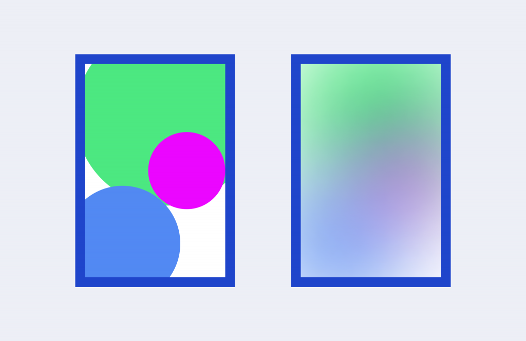
Aurora UI is a design gradient effect that resembles the Northern Lights. They are also called Aurora Borealis. You combine several colors that smoothly blend one into another. The designer can mix adjacent tints on the color wheel, and completely different colors. The main thing is that they must be compatible.
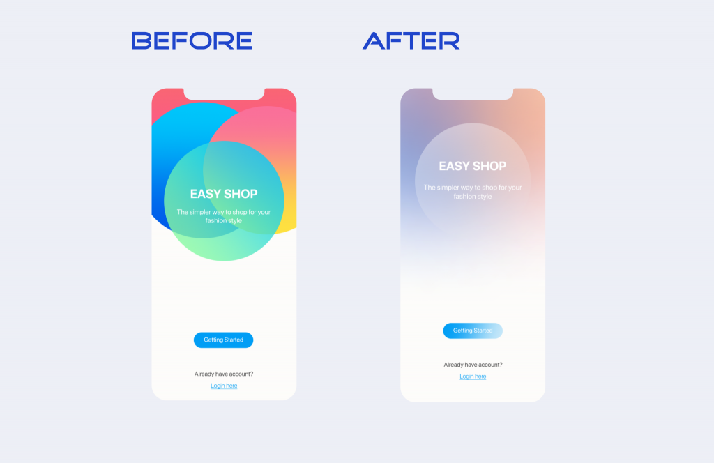
Gradients allow a person to perceive text, figures, animations, and other UI components as something three-dimensional on their screen. It makes the object or background appear more realistic and deep.
Why Should You Use the Aurora Gradient in 2022?
Attract attention to specific page elements
The Aurora gradient effect stands out from the classical colors. Therefore, it helps to focus the attention of potential customers on specific areas of the text, calls to action, and other important data. You can also make buttons more voluminous and realistic by combining different light and dark colors.
Save the company brand style
Imagine that you want to add a photo to the page. But it does not fit your design. You can process it with a gradient. Plus, it’s a great way to make it more interesting and unique. Use the Аurora visual effect to match the color scheme of the site.
Diversify the background
Minimalist designs have been on trend for several years now. But if you do want users to remember your website, you should complement it with bright or original elements. Gradients help you get new tints by experimenting with different color combinations. They look unusual, so they will definitely attract the attention of visitors. Use soft tones and intense colors to express the mood and values of the brand.
Place text
You use an image as a background, but you cannot match the font color to make the offer stand out. Implement a gradient to all or a part of the photo where you add the text. So you do not have to cover it with shapes and other elements to make the phrases visible.
Add volume to illustrations
You can achieve a three-dimensional effect using color transitions, shadows, and lights. If the illustrations seem boring, add an Aurora gradient. It will help you bring them to life and make them more realistic. Users love to view such pictures, so they stay longer on the page. The more time they spend on your site, the more likely they will do what you want them to do.
How Can You Implement the Aurora Effect in Web Design?
Text. Emphasize important information or underline phrases that call the customer to action. You can select specific parts of the text using gradients. This way, you stand out keywords and make regular fonts unique.
If you want to get a harmonious combination of text and gradient, you need to:
- choose colors that do not compete with other bright elements on the page;
- select only part of the text, for example, one word or a short phrase;
- create contrast using a bright gradient on a black or light background;
- make the text easy to read.
Background. Often, designers use an Aurora effect as a complete background image for their home screen design. Color transitions attract the attention of сustomers, which is why they are also popular in creating banners with promotions, discounts, or special offers.
Photos. Add a gradient of your company colors to the image if you want to personalize it and make people explore it. This effect can also help hide imperfect photos. For example, if some colors do not match well with your brand style, or you need to hide something. But do not expect that you could cover up the bad quality pictures in this way. You risk making a bad impression of your company.
Individual elements. You can highlight buttons, underlines, frames using a gradient fill.
Examples of Applying the Aurora Effect
Let’s look at a few examples of brands that have used this effect in their website designs to show how the aurora UI should look.
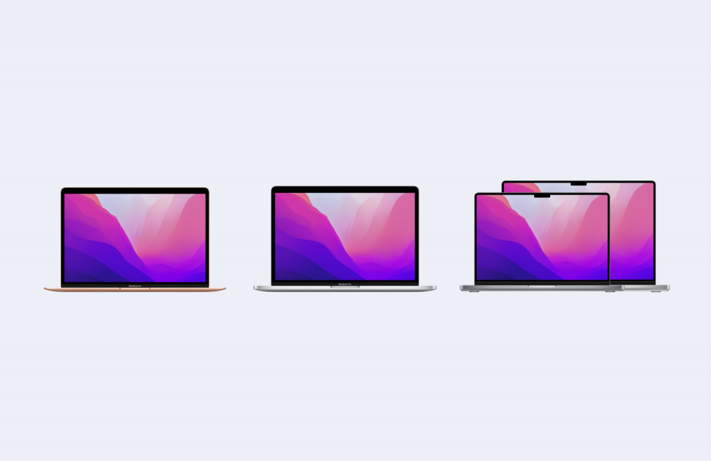
Apple is one of the first companies to popularize the gradient trend. They use it in their presentations, on the website, in the interfaces of their devices. For example, you can see this effect on the iPhone and MacBook home screens, banners, text, and more.

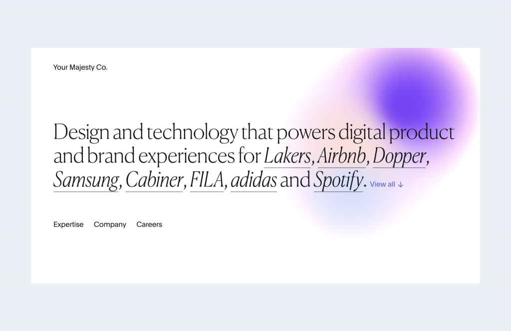
Your Majesty Co. created animations based on the Aurora effect in the web design of their site.
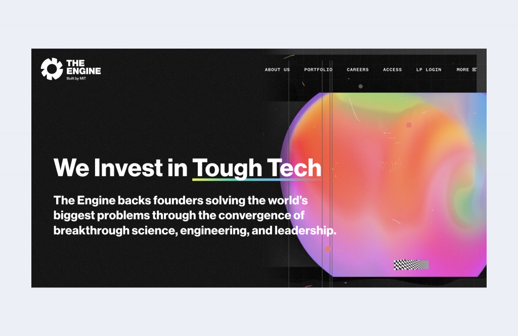
The Engine applies a gradient to emphasize the text and diversify the rigorous design with colorful shapes and buttons.
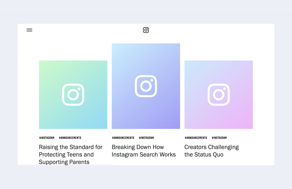
You can find many examples of the Aurora effect application in the design of the official Instagram website. Even the logo of this social network is made in this style. See how designers emphasize keywords, make buttons stand out, and complement the minimalistic design with bright gradient banners.
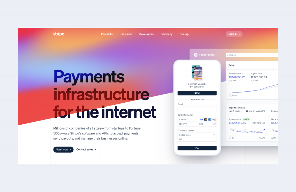
Stripe shows you how to integrate the Aurora backgrounds into your homepage design.
Conclusion
What is the importance of web design for your audience? Why should you know and implement such trends like the Aurora gradient effect? Good web design helps guide your users’ eyes and tell them where you want them to look. Therefore, this technique will help customers not to miss important words or paragraphs.
Aurora UI allows you to stay in trend, saving a minimalistic web design. But at the same time, it helps to make it memorable. Do not apply the gradient to all elements at once, as it will distract the customer’s attention. Highlight key information only, or overlay them on images to make the text appear more visible against their background.
