

Mobile First indexing by Google is one of the most notable recent SEO trends. That is to say that the mobile version of a website is a priority for the Internet and businesses today. More and more people use their mobile devices to go online instead of laptops and computers. The good news is that the Mobile First indexing principles are easy to understand and apply. Here are the basic rules and processes you need to know.
What is Mobile First Indexing?
According to some of the major statistical and analytical organizations, more than 88% of users use smartphones, tablets and other mobile gadgets to surf the net. And this percentage continues to grow, while the share of Internet traffic from desktop devices is declining. This trend is quite logical, the technologies of mobile devices and networks are developing faster than ever.

Mobile indexing has come a long way over the years. It’s great to see how the web has evolved from desktop to mobile and how webmasters are helping Google crawl and index web pages based on how users interact with the web. Google values collaboration with webmasters to help make this transition a smooth one.
In 2018, Google has announced a series of recommendations to prepare site owners for the new indexing rules. Starting from July 1, 2019 Google has applied its mobile-first approach to all the new websites. Mobile-first indexing brought a global change at Google. The initiative was developed to make the Internet more mobile friendly. From now on, it is the mobile version of your resource that will be indexed first, which will directly affect the ranking of the site as a whole.
How Does Mobile-First Indexing Work?
The main task of Google mobile-first indexing is to switch to one indexing algorithm. Before the mobile focused indexing, Google has had separate indexing algorithms for every kind of device that can use the Internet including PCs, laptops, phones, and tablets. That is why the results of issuing the same query on phones and computers were different.
By inventing the mobile-first indexing algorithm, Google prioritizes the mobile version of the site, but considers both of them. Thus, after a complete transition to the new indexing method, the results of organic search results on desktop and mobiles are the same.
The name Mobile-First Index speaks for itself. Note that the algorithm is not called Mobile-Only, since not only the mobile version are being evaluated. To be visible for Google mobile-first indexing, your resource should have an adaptive web design layout. If there is no adaptive layout, you can use a separate subdomain. In this case, you will need to perform a number of steps aimed at optimizing the site in accordance with the new algorithm. Follow our tips for mobile-first indexing optimization of the site below.
The key points of optimization to pay attention for
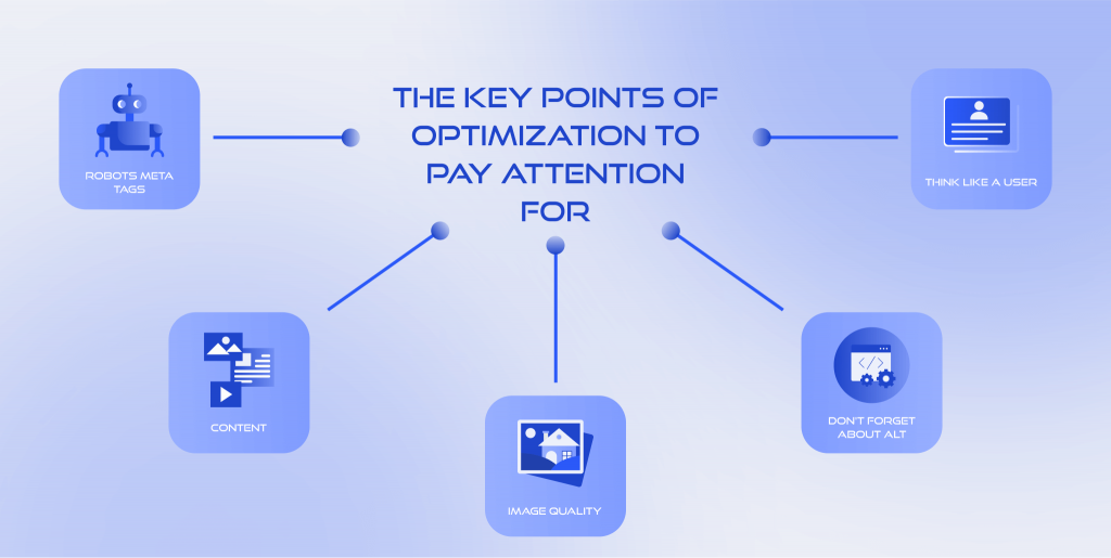
Robots meta tags
Make sure you use the same tags on both versions of the site. If Google notices differences in the mobile version, then it may well refuse to index these fragments.
In addition, if you disable certain URLs in robots, the search engine can render pages incorrectly and underestimate their ranking.
Content
If the mobile version of the site contains less useful information for the user than its desktop counterpart, mobile-first indexing algorithms simply will not be able to access certain content. The situation can take a critical turn if the content is texts optimized specifically for SEO.
Image quality
Chasing high download speeds on mobile devices can backfire. Visual content of poor quality or small size runs the risk of not getting into Google Images. And this is another drawback for your ranking position.
Don’t forget about Alt
Image meta tags continue to be an important part of SEO. The mobile version’s image description should not be less complete or relevant than the desktop version.
Think like a user
How does your website appear to the people who are viewing and scrolling through it? Is your content organized the same way on both variants? Test the UX of your web resource on both its versions and make sure it’s what your customer wants. Pay attention to site and media loading speed, quality of content, etc.
Google also stated that a low-quality or unfinished mobile version can have a much more negative impact on the ranking of a resource than its absence. In simple words, it’s better not to have a mobile version at all than to have a poorly optimized one. Therefore, before launching a site adapted to smartphones, make sure that it works and is of high quality in terms of SEO.
Are You on Mobile-First Indexing?
The best way to find out is to use the appropriate tool in the Google Webmaster Tools console. Specify a mobile user agent and see a preview after rendering is complete. What Google shows you in the results you get is most likely what Google can see and index from your mobile site.
Common questions about mobile-first indexing
How does mobile first indexing work?
Mobile first by Google is a completely natural phenomenon that appeared in response to the needs of its time. There are more and more mobile users, so if you do not want to lose a significant part of your audience, you should take care of optimizing your own website.
So, that’s what basically happened to Google’s search ranking algorithm:
How it used to be: before, all users who watched something on the web using their smartphone received the result for their query from the mobile index.
In turn, those people who did it using a regular computer got desktop results.
How it works now: now it doesn’t matter whether you use a phone or a laptop — you will see the results from the mobile index.
Mobile first is an algorithm from Google that was created specifically for the new principle of shaping what you see on your display in search results.
How does mobile first indexing affect my website?
Mobile indexing is simply how Google crawls and indexes websites. Instead of looking at the desktop version of the page, Google looks at the mobile version of the page. Simply put, Google crawls and indexes your web page based on how it appears on mobile versus desktop. Now more than 50% of what is in the Google index is ranked compared to indexing for mobile devices.
Are all the websites now indexing mobile first?
Today, 70% of sites from Google search results have already been “switched” to this type of indexing. The final translation to mobile-first indexing will be carried out by the search engine for all sites that are ready for this change.
How to disable mobile-first indexing by Google?
It is not possible to disable the mobile-first indexing for the website. And to be honest, there’s no need to do it. If mobile traffic dominates the Internet today, why would you ignore it instead of making profits? It is better to develop and optimize a good adaptive mobile website than to spend resources on avoiding the mobile-first indexing.
How to find when your site is switching to mobile first indexing?
To find out if your site is included in the mobile-first Index algorithm, you need to check Google Search Console service. In fact, most webmasters get a special notification when their site goes mobile. It usually says “Mobile-first indexing enabled for SITE_NAME”.
How to Develop a Perfect Website for Mobile-First Algorithm ?
Mobile commerce is the game changer today because its share takes about 73% of all retail sales in eCommerce today. This leads to mobile site version development and new technologies appearing. Website optimization for various types of devices has long been one of the mandatory items in the terms of reference for development. And today you can hear more and more about the Mobile First approach.
The Mobile First strategy, as the name implies, involves designing the interface of the site, first of all, focused on mobile devices. The philosophy of the approach is to prototype the design for the smallest screen first, and then move on to larger displays. This is the main difference from the classic Desktop First approach that web professionals have been using for many years.
Traditionally, the process of creating websites begins with the development of a layout for computers and laptops, because they have high performance, and a lot of content can be placed on a large screen. Further, the finished version is adapted to other devices, taking into account their capabilities. Why was it necessary to come up with a concept in which everything goes in reverse order?
The fact is that not all visual and functional elements of desktop sites can be transferred to the mobile version, while maintaining the same ease of interaction. Quite often, optimizing a site for smartphones is accompanied by various problems: long page loading, difficult navigation, inconvenient CTA buttons, etc. What can we say about the UI that the designer worked so hard on! For a small smartphone screen, you have to remove a significant part of the beautiful, but not functional elements.
What is the difference between adaptive, responsive design and Mobile First?
Current web design trends for mobile optimization have three most popular options to consider: Adaptive web design and responsive web design as classics and the new one called Mobile First. Which one is better? Let’s remind you about their features.
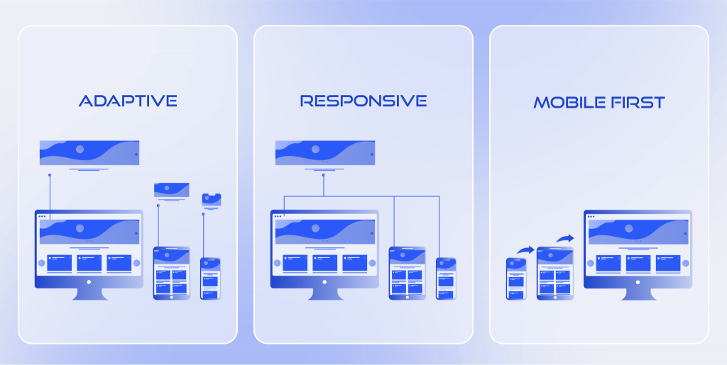
Adaptive Web Design (AWD)
Adaptive web design has several static layouts developed for different types of devices. Templates contain structures for placing elements depending on the width of the display. Usually layouts are created for several standard widths, for example: 320 px, 480 px, 768 px, 960 px, 1200 px, 1600px. The scripts determine the user’s screen dimensions and load the appropriate template based on those breakpoints.
Responsive Web Design (RWD)
In this case, a developer creates a flexible layout that allows the page to adapt to absolutely any screen width. Automatic content resizing works on all devices due to the moving grid, flexible images and media queries.
Responsive layouts take into account the features of various devices. For example, for desktop screens horizontal orientation and a large viewing area, and for tablets and smartphones touch control and the ability to rotate the device for viewing.
Responsive Design is a good option because you don’t need to develop multiple versions of your site. At the same time, it is necessary to carefully check whether all elements are displayed correctly on screens of various sizes.
Mobile-First Design
This method means creation of a mobile version with a small screen. It can be scaled up and, depending on the platform or browser, developers can add additional options or other styles. Thus, no matter from what device a person views the site, they will always receive a correctly displayed version.
Summing It Up
We are glad that you’ve learned about the importance of mobile-first indexing from us. It’s not hard to test your website and optimize its most important things for mobile-first indexing. If you manage to invest your time and resources into creating a good mobile version of the site, it is better to hire a professional agency and make sure you’re getting a completed product.