Sometimes your customers add products to their cart, but the checkout doesn’t happen. How can you fix this? In this article, we have collected best checkout practices that already helped other online stores to get more orders. And you can grow your sales, if you make a few changes in the checkout process on your site.
What is Checkout Abandonment?
The checkout abandonment means that a customer started filling in the checkout form but left the page without completing the process. According to statistics, more than 50% of users add a product to the cart but do not buy it.
What’s stopping them from paying for their purchase? Most popular reasons for cart abandonment in e-commerce are:
- Customers are not going to buy anything right now.
- They are comparing you to your competitors and have not yet decided where to buy.
- They have problems or difficulties with the ordering process.
- They cannot purchase products without registration.
- They need to fill in a lot of information to place an order.
- The buyer cannot find a convenient payment method.
- The customer finds out about the additional costs too late.
An uncompleted checkout reduces store revenue and increases marketing costs. So if you want to sell more, you need to optimize the checkout process and improve the customer’s engagement. It’s not easy to change the customers’ habits of delaying a purchase or comparing your products and services to other stores. But you can make it more convenient and easier for them to buy something on your website. Let’s take a look at a few key recommendations that will help you to improve your ecommerce checkout process and increase the conversion rate of completed orders.
Top eCommerce Practices That Influence Sales
Optimize your website for mobile users
About 50% of users make purchases using their smartphones. If the interface of your website or store is not adapted for the mobile version, it will greatly complicate the ordering process for a potential client. There is a great risk that they will not make an effort and look for a similar product in the stores of your competitors. Create a responsive website design so customers can shop using their smartphones.
Allow orders without registration
If you want to understand how to sell on your website, you have to consider the different preferences of your customers. Some users do not like to register. Someone wants to quickly choose and buy, so they do not like to fill in many fields in the registration form. If customers plan to make a one-time purchase, then the process of creating an account seems to them an even more pointless waste of time.
Allow ordering products without registration. Alternatively, let a person register using a social media account to make it easier for them to enter their details.
Don’t ask for unnecessary information
Email, name, phone number, and delivery address are the most important information that you need to get from the customer for checkout. The rest is not so important anymore. Nobody likes to share their data. And the more questions you ask, the more obstacles you create to checkout because long forms scare users away.
Do not try to ask a user for their age, country of residence, zip code, or mother’s maiden name unless you really need to get this information. Any additional question can deprive you of a client. Ask yourself, is it worth the loss? Reduce the number of questions to a minimum to create high converting checkout pages.
Help your visitors by using a live chat
A сustomer may have questions or doubts during the cart checkout. Add a live chat option or the contacts of the support team on the ordering page so that the user can get answers without leaving the form. If you do not provide them with all the necessary information on time, you risk losing the client. Use chatbots to automate customer support and increase sales.
Use a clean design and remove distractions
Nothing should distract a user from the purchase. Remove unnecessary design elements to create a better checkout experience. Delete the footer, header, search bar, information about other products, and anything that is not relevant to the ordering process. It will help your customers focus on checkout and lead them to finish the order step by step.
Offer adequate and most popular payment methods
Use the ecommerce checkout best practices and allow customers to choose a payment method that is convenient for them. Make a list of the most popular options and integrate them into your website. There is always a risk that a person will abandon a purchase if they have to pay in an unusual way for them.
Focus on safety
If a customer buys from your store for the first time, they may not trust you. A person should feel safe when he or she orders something on your website. One of the reasons for uncompleted checkout is doubts about the security of the payment system. If you want to reduce cart abandonment, insert safety signs in a prominent place. Do whatever you can to convince the prospects that they can trust you. Improve the security of your eCommerce website if it’s needed.
Use form validation and error notifications
People can be very inattentive and forget to fill in some important fields of an order, or do it incorrectly. This can lead to the confusion during the checkout process. One of the shopping cart best practices is to immediately highlight incorrectly filled or missing information. So the buyer can quickly fix everything and continue the process.
Remove surprise costs and fees
The customer wants to know exactly how much they have to pay for their orders because they count on a certain amount of money. Let’s say they decided to buy boots for $200. But when they go to checkout, it turns out that the amount of their purchase is not $200 but $255, including taxes and delivery costs. When they find out such information at the end, they feel deceived.
List any additional costs at the beginning. Apply ecommerce website best practices and add a delivery calculator to your website.
Use progress indicator to guide checkout
Uncertainty scares our brains. Therefore, when a customer does not understand how long it will take them to complete the buying process, they may “get out of the race early”. It is convenient for users to see where they are now and how many steps are left to complete. Improve your ecommerce checkout design using the progress indicator. Plus it creates the effect of a “to do list”. A person can perceive each step as an opportunity “to put a tick” in the process. This will further stimulate them to complete all stages of the ordering process.
Auto-save cart contents when abandoned
The user may not always be able to make a purchase right away. Let them keep items in their cart even if they have left your site. If the customer again has to search for products and add them again, they can abandon this process. Autosave shopping cart contributes to checkout optimization and increases your chances of getting more orders.
Tell the date, not the delivery time
Do not force the buyer to count when they will receive the delivery. Many people want to receive their order on a specific day. They care about the date, not the number of days. Provide them with several delivery methods so that they can choose the most convenient and profitable option for themselves. This little act can also affect checkout page optimization.
Divide the ordering form into sections
How often do you postpone solving an issue if it looks difficult or time consuming? But if you split it into several small and understandable tasks, then it is much easier to get started and complete the process.
When a user sees a long form, they may want to postpone the filling process or not do it at all. Because they perceive it as a difficult and unpleasant problem. Divide the form into sections, so the buyer can complete this task in several small steps. This approach can help you in ecommerce checkout optimization.
Use discount and promo codes carefully
When you offer a customer to use a promo code or special offer, make it so that they can quickly find where to enter it. But do not place this field in the most visible place. If the customer does not have this promotional code, they can leave the cart to look for it. There is a high risk that they will not return to checkout.
Ask to complete the credit card information at the end
A person feels more comfortable if they start with simple tasks and gradually move on to complex ones. It takes more effort to enter your credit card information than writing your name or email. Therefore, leave the data of payment at the end of the ordering process. This will give you more assurance that the customer will reach the goal and pay for the purchase.
Fill in the data of the registered user automatically
Automatic filling of data will help to shorten the checkout process. This means that it will increase the chances that a person will make a purchase. Eliminate the need for repetitive actions.
Implement a service for calculating the cost of delivery by different transport companies
Use a service that will automatically calculate shipping costs. Users could quickly select the best option for them. If the cost of delivery affects their choice, then you will help them do it without leaving your site. They cannot be distracted by extraneous services when they make an order. The shoppers may forget to buy or switch to something else.
Offer related products in your shopping cart
You can sell many products together. Offer items that complement each other before checkout. This will help you increase the average check amount without additional investment. For example, let’s say you are selling a laptop. Suggest the most popular cases and bags for this model. At this point, a customer is most open to your recommendations. Especially if you make them an advantageous offer to buy related products at a discount.
Make it possible to pay for purchases using Google Pay and Apple Pay
Many people use e-wallets and find it more convenient than paying with a credit card. Let them feel comfortable shopping on your website.
Benefits of Google Pay and Apple Pay:
- you do not need to enter data;
- you can pay in one click, and you need to enter a short code, put your finger or scan your face to confirm the payment;
- customers are confident in the security of payment.
Figure out the reasons of the checkout abandonment
Try to understand why the customer did not complete the checkout. They might have problems with payment, the Internet connection was lost, or they entered some data incorrectly. There are many reasons. Collect feedback and optimize your buying process. Save the contact details of users who have not completed the checkout. Then send them letters notifying of the unfinished purchase, asking if you can help with something.
What can You Do if the Customer has Left Your Site without Buying?
Start retargeting users who have added an item to their cart. I will explain what retargeting is if you do not know yet. This is an advertisement aimed at people who have done some targeted action on your site or just visited it. Remember you looked at clothes in the online store. And then its advertisements haunted you for several weeks. This is called retargeting.
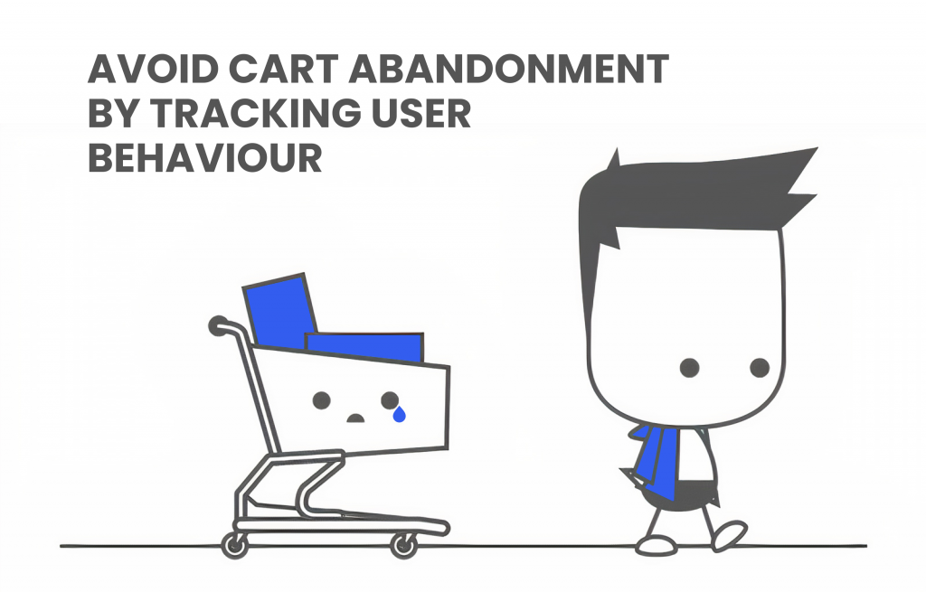
How does it work? You install a fragment of a pixel on your site that tracks user behavior and collects information about it. If you set up retargeting through Facebook Business Manager, then you will show it to people on Facebook and Instagram. You can use Google Ads remarketing to show advertising to interested users on Google partner sites, in search results.
Conclusion
We advise you to optimize your checkout page to keep your carts abandoned to a minimum and maximize your income. Use our list of top commerce shopping cart best practices to understand what you need to change. It will take some investment in optimizing the design and development of the site, but it will pay off later. Take analysis before and after implementing new modifications to know how they affected your sales. Remember that the user should feel comfortable using your site. Their discomfort is your loss of profit.


